Part of the requirements of Nat's blog hop is to link to your all time favourite layout ... now there's a conundrum!
 |
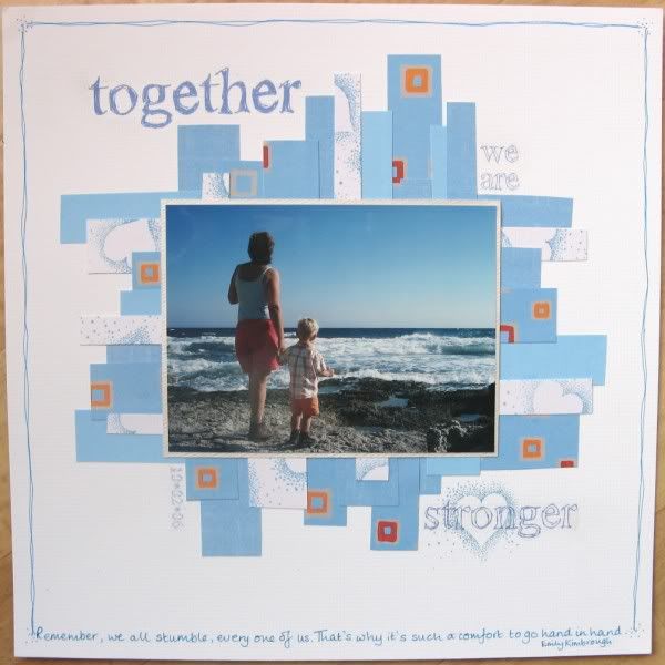
| Remember, we all stumble, every one of us. That's why it's such a comfort to go hand in hand. Emily Kimbrough |
It was inspired by a page called "Laugh" by JoolsG who seems to have moved over to digi-scrapping these days.
I loved my page because it was simple and clean, it used my friend's beautiful photo, it had a quote that was perfect and the title was also apposite! On top of all of that I had great fun making the title rub-ons myself using the !Sketchy Times font and special Crafty Computer Paper.
On the other hand, I wanted to choose a layout that I still owned, one that was my own design and contained more of me!
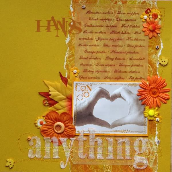
In which case, it would probably have to be this one from 2009, which was made for a challenge over at Indigo Mill (I miss their shop).
I had fun thinking of an A-Z of what my hands can do; I took the photo of my hands myself, having mastered the self-timer; I included lots of sewing on the page and best of all, I managed to use up some un-loved peel-offs to transform some truly awful shiny paper into an interesting background.
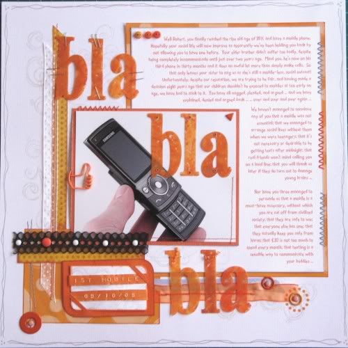
Looking at that page got me thinking about another page I did for an Indigo Mill Challenge - this one telling a story about my mobile phone battles with my kids.
The challenge had been to make a page without any adhesive at all. I had a lot of fun with staples, sewing, brads, grommlets, clips and even punches to affix the various elements to the page.
However the main reason that I love this page from 2008 is the journalling - it takes the form of a monologue addressed to my middle child who, like the others, had to wait until he was 16 before being able to have his own mobile phone. It lists the reasons why the kids wanted phones, and the reasons why I didn't want them to ... a piece of our family history!
Now, back to the conundrum I started with: my all time favourite layout.
On the one hand, I like the page about my hands. On the other hand I like the page about our mobile phone battles. But which one is best? According to Harry Hill, there's only one way to find out.
FIGHT!


you know Jemma I'd be hard pressed to choose a favourite amongst those too - they are all fab, but if pushed the second would probably just pip the others for me (do I still have to fight?!) x
ReplyDeleteYup, now there's a conundrum. It's be hard to pick a fave too since all three has its own charm and style. I'd probably pick either the 2nd or 3rd though just 'coz I'm biased towards my own style. =p
ReplyDeleteBut they are all fun. And have unique stories to tell, which I think is the most important thing. =)
Thanks so much for dropping by Punky Scraps! =)
love all three layouts!!! you have such a fun style. thanks for linking up to the punky scraps blog!!
ReplyDeleteI couldn't choose between them, but it's all right to have more than one favourite isn't it? Like kids lol
ReplyDeleteYay :) Thank you for posting these :) Those layouts are all amazing!!
ReplyDeleteThanks for playing!
Nat xox