 |
| Gabrielle's original page |
I had a good look around the Master Forgers' blogs earlier in the month and found LOTS of inspiration, but in the end I settled for a page from Gabrielle's blog from last year. I love the stitched background, the playful leaves, so perfect for her photos and the colourful strips of patterned paper with more stitching. Gorgeous!
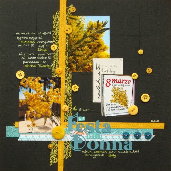
I have a stack of photos from my recent trip to Italy where it wasn't the leaves that were catching my eye but the Mimosa trees. Vibrant sunny yellow balls contrasting against the dark leaves and the clear blue skies. On our first day in Italy there were sprigs of Mimosa everywhere - in vases on cafe tables, in children's hands, in shop windows - we had no idea why. We knew that back in the UK it was Pancake Day - perhaps this was the Italian way of celebrating Shrove Tuesday?
No! It turned out that this was not only the last day of Carnivale, but it coincided with La Festa Della Donna - Women's Day (and the 100th one at that!).
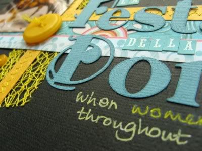
Everything except the yellow lacy trim and the journalling spot is from my April Counterfeit Kit. The journalling was written directly onto my background cardstock with a white gel pen which I then coloured in with two shades of yellow pen. The title alphas are cut with Broadway Melody Sizzlits.
The page also tied in with a weekly challenge a few weeks ago over on UKS ... scrapping a celebration, flowers and blue!
Thank you Gabrielle for helping inspire my page. If you want to see another forger's forgery please hop over to Margie's to see what inspiration she has selected! Thanks for stopping by.


so pretty!
ReplyDeleteI love all the random buttons!
Mental note to scraplift also! :)
That's a stunning, striking page Jemma - the colours are amazing.
ReplyDeletelove this! Those flowers are so vibrant, it must have been beautiful! Your layout looks perfect. And I LOVE that title font :)
ReplyDelete*meridy*
Great LOs!!
ReplyDeleteThis is so great, I love the yellow against the black and the journaling is superb. Jen x
ReplyDeleteLove the sprinkling of buttons - must file that idea away!
ReplyDeleteBeautiful layout and photos, Gemma! I love the blues and yellows on that black background, too-stunning!
ReplyDeleteVery pretty! I love how the bold colors just pop against that black background!
ReplyDeleteSO Striking! I love it! Great job!
ReplyDeleteSo very pretty!
ReplyDeleteFantastic colors! And what a great story!
ReplyDeleteBethany
Gorgeous! I love the random placmemrnt of the buttons. The yellow on black is beautiful!!
ReplyDeleteSo pretty!!
ReplyDeleteartistic and creative
ReplyDeleteI'm so flattered that you counterfeited my layout!! I did that one so long ago, you must have really had to dig to find it. Your layout is just gorgeous! The black background is so dramatic and really makes the other colors pop! The mesh and scattered buttons are perfect accents!
ReplyDeletestunning. The colors are striking and vibrant. They show of your photos great!
ReplyDeleteGreat lift - I think you improved on the original ... and your choice of colors is awesome!
ReplyDeletethat is such a striking Lo, the gorgeous blue and yellow against the dark backgound is sooo effective, it must have been amazing to see in real life!
ReplyDeleteFabulous colours! I love the way the blue and yellow pop on the black background.
ReplyDeleteWow! The yellow against the black really pops!
ReplyDeleteWhat a great lift! I love your yellow and blue on the black background. Lovely!
ReplyDeleteI love the yellow, blue and gray together, just stunning!
ReplyDeleteI just love your take! Both LOs are beautiful :)
ReplyDeleteI love the colors. Your LO just pops and I also think it's an improvement on the already fab original!
ReplyDeletethis is fabulous - the colours are so rich and really stand out against the dark background! Love it!
ReplyDeletesuch a wonderful combination of colours and stunning photos. love it
ReplyDeleteThe black paper makes your photos and embellishments stand out so well. It looks great.
ReplyDeleteI really love your color combination! Beautiful layout. Very cool to learn about a foreign holiday! xoxo
ReplyDeletegorgeous textured background, love the yellow with black combo and cool travel story too :)
ReplyDelete