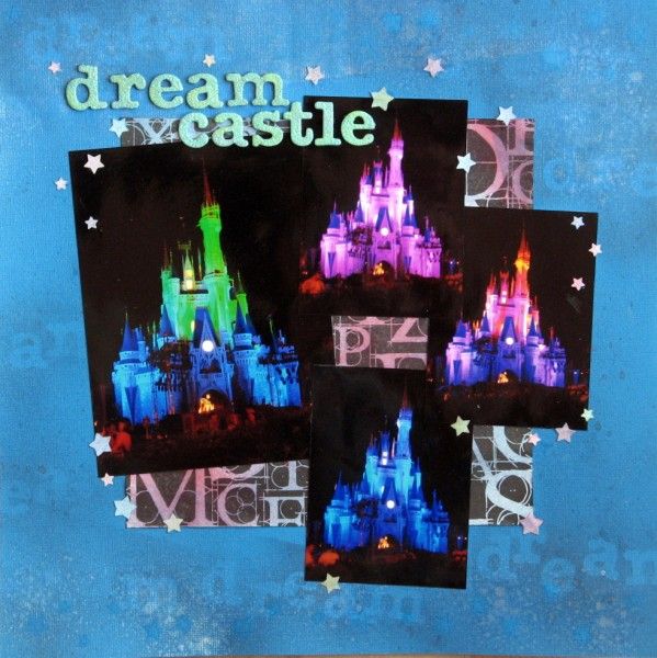
Now Challenge #1 this month over at the Counterfeit Kit Challenge Blog was a real challenge for me: I don't like messy scrapping! The lack of control with splattering paint or ink around leaves me uncomfortable, but a challenge is meant to be challenging so I got stuck in anyway! I dug out some masks and a friend's spray inks and got busy ... and then threw away all of those experiments as they really didn't work with the photos I wanted to scrap with! Instead, out came some star punches, some scrap card and one of the offcuts from my May Counterfeit Kit.
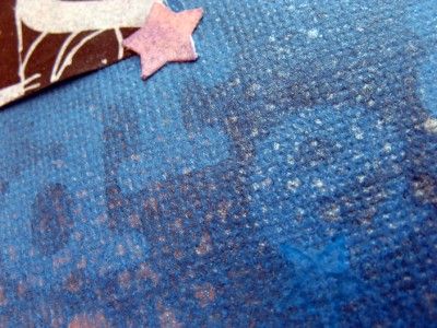
The bright white contrast was removed from my black & white paper with shots of blue and red mists. I then laid the stars, punched from the scrap card, out along the top and bottom of my base cardstock and sprayed over them with a blue shimmer spray. The idea had been to leave star shapes visible, but the effect was very subtle. After leaving the paper to dry flat under some weights (another reason I'm not happy with messy scrapping is that I'm slow enough without drying/flattening time) I decided something else was needed!
So I laid out some of my title alphas (American Crafts Dear Lizzy glitter thickers) and sprayed lightly over them before repeating the process around the base cardstock. Much happier with that effect - still subtle, but in a good way. The punched stars didn't go to waste though - I added them on top!
This challenge will be used for the CKCB Members' Blog Hop later in the month - why not sign up here and have a go!


Go you with the misting. I tend to use mine in drops and splatters - I just don't seem to be able to produce a good mist.
ReplyDeleteYou won the draw for the blog hop btw. I'll get it in the post this week (hopefully!)
I have all these photos too and you have showcased them beautifully x
ReplyDeleteThis is gorgeous, Jemma, you should "get messy" more often ;) I know what you mean about the drying/flattening time though. It's the patience I don't have!!!
ReplyDeleteWell done on trying & persevering with a technique you're not keen on, its turned out really nicely.
ReplyDeleteyou made me giggle with your " I threw it away" comment - sounds like me! But the perseverance worked because the subtle effect is gorgeous. perfect for a fairy tale castle and all the better because you made it your own. And I'm with you on the time to dry - drives me crazy. but not as crazy as the warped paper... now that really sends me mad!I
ReplyDeleteDrying and flattening time is a struggle here too - I want to be done and on to the next thing. Really like the dreamy effect you've created with the mists tho'. Well done on achieving the out of your comfort zone bit too.
ReplyDeleteI usually get more ink on myself and the table than I do on my project, but a challenge is a challenge, so I'll have a go. Love your example the sprayed over alphas make a lovely background.
ReplyDeleteI really like the subtle effect you have created..it's nice to see a bright colour and a more subtle effect combined. And that's a good point - I'm such a slow scrapper I don't like waiting for things to dry either
ReplyDeleteAll kudos to you for trying something which does not feel smooth or easy! The page turned out really well, with the depth of the background acting asa great foil for your dramatic photos .... Will you try it again?
ReplyDeleteWow - that castle glows even more on that background!
ReplyDeleteRinda
Those are such beautiful colors in the pictures. And the black on the blue blends so well. Thanks for stopping by my site and commenting. I am now following you thru GFC.
ReplyDeleteJulie
I Create Purty Thangs
Well done you! I've got a number of mists but I rarely use them because I prefer control, like you said at the beginning. Fabulous photos too!
ReplyDeletelove your result. nice magical layout
ReplyDeleteSuch a pretty layout - never would have known you struggled with it! I love your masking! I never think to use words to mask! I always just use my templates. I may try that for the hop!
ReplyDeleteWONDERFUL masking technique! I love the repetition of the dream theme. The pictures really stand out against your background!
ReplyDelete