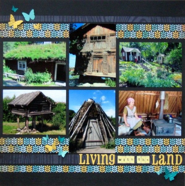
 Challenge #3 over at the CKCB this month was to use a grid.
I love grids. I think I'm naturally a straight lines scrapper and have to occasionally force myself to angle things on the page. Even then ... I sometimes use grids!
This page is the sixth, final and fastest one I made at my recent scrapping retreat. Originally I'd been thinking of using these small photos on a double page spread about Skansen in Stockholm, but, in truth, I have enough shots for a triple or quadruple page ... so I decided to put the photos of buildings onto one dedicated page.
A few strips of patterned paper from my October Counterfeit Kit and a little butterfly punching (!) later and it was ready. I may add a date and place but will probably just leave that to the journalling on one of the other pages from the day.
P.S. Since there's no journalling on the page - you may be interested to know that the buildings on stilts are from Swedish regions where they get a LOT of snow!

I like grids too - I like the strips of paper. Those really are gorgeous colours in this month's kit.
ReplyDeleteI remember the story of the house on chicken legs/stilts that walked :)
What a wonderful page to highlight some beautiful buildings.
ReplyDeleteI really like grids as well....and this one works perfectly.
ReplyDeleteReally beautiful, love these deep colors and how they make the photos pop !
ReplyDeleteCool houses! Great page!
ReplyDeleteLove this Jemma...I'm a straight line person too!..lover the papers
ReplyDeleteAlison xx
straight lines and grids work for me. a lovely layout x
ReplyDeleteI am fascinated by these houses :). And your grid scheme is perfect for the architectural theme - I do like those pretty bands of paper too.
ReplyDeleteI like this a lot. I recently finished a grid page too. It's a sketch I think I will be using more often.
ReplyDeleteLove this layout colors are yummy paper gorgeous
ReplyDeleteThe paper strips are so beautiful & perfect! These photos are so different & interesting - it should be fun to write about this.
ReplyDeleteGreat layout, those houses are really neat!
ReplyDeleteLove that page. The colours are gorgeous and those butterflies set it off perfectly.
ReplyDeleteThis grid is lovely. I love the colors.
ReplyDelete