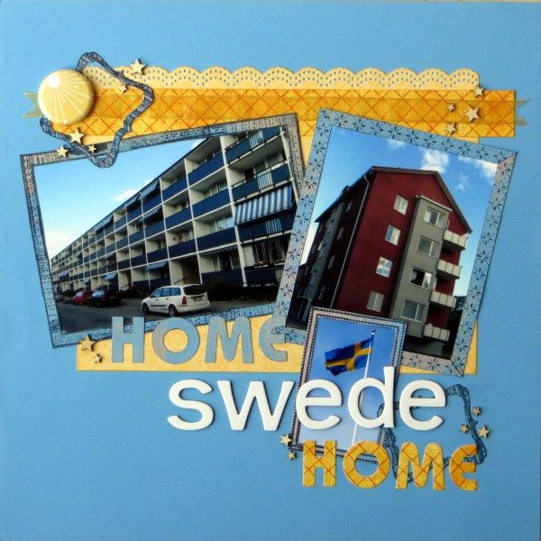
Forgive the pun, but I couldn't resist it for these snaps of where I used to live in Sweden ... we did a little trip down two memory lanes during our Scandinavian tour last summer. I'd never lived in a flat before but both were rather comfy, warm (triple-glazed against the Swedish winters) and not too high (no lifts)! I've added arrows and addresses since photographing the page.
I wonder which of this month's challenges will feature on the next stop on the hop: Tina's blog.
If you get lost whilst hopping the full order is published on the Counterfeit Kit Challenge Blog today.
P.S. There's still time to have a go with the S J Crafts April Challenge and be in with a chance of a prize ... check it out ... plus the winner & favourites from March's challenge has just been announced here!

I love punny titles - and the color scheme here is fab too.
ReplyDeleteI love the layout, how do you get your photos so square? I've been struggling with that for a while!
ReplyDeleteBrilliant title, gorgeous colours and that flair is just so cute ;)
ReplyDeleteLove how your colours replicate the flag :)
oh I adore that flair! it's perfect for this and totally gorgeous! Lovely page and isn't it lovely to go down memory lane like this - sounds strange but I did it in Birmingham a few years ago and have been slowly working through some of those stories which I only thought to capture now that I don't live there any more!
ReplyDeletelove the colours on this and great photos
ReplyDeleteA great pun! Nice clear photos and fun borders. Cute flair too.
ReplyDeleteVery clever title for a lovely walk down memory lane.
ReplyDeleteI think it's a great title because it actually tells you more than the simple "Home sweet Home" would
ReplyDeleteSuper cute layout, a fun pun too. The colors are marvelous and I like the design of the layout
ReplyDeleteCan't beat a good pun for titles IMO :)
ReplyDeleteGreat LO.. love the 'play' on the title.
ReplyDeleteMy Dad loves his puns - he'd be proud of a title like that! :)
ReplyDeleteThat's a great title and page!
ReplyDeleteI love love your flair and the entire design of the layout. You have reminded me how much I miss Scenic Route! I absolutely love all of the international participants in the blog. I get to travel to places I will never see in person.
ReplyDeleteVery striking design Jemma and that big title has a real impact - love the fresh colours, I think it has a really Swedish feel to it! :o)
ReplyDeleteI too love the play on words...good trip down memory lane...I should go back to the apartment I lived in when I was in my 20's and photograph/scrap it:). Great LO!
ReplyDeleteI'm partial to a good pun. Loving the flair and the scattering of stars.
ReplyDeleteI like the cool Scandinavian blue you've used on the LO and the yellow complements it beautifully.
ReplyDeleteLove everything on it, the colors, the embellishments, the stamping... ! So inspiring !
ReplyDeleteGorgeous layout, love the swedish colour scheme and puns are fun :-)
ReplyDelete