Did I mention that I like sketches? When I saw
Sketchy Thursday's offering this week I knew I had to use it - and so I have stayed up
very late tonight to get this page finished before the deadline! Naturally I changed a few things and of course I used some more stash from my home-made Counterfeit Kit (contents
here).
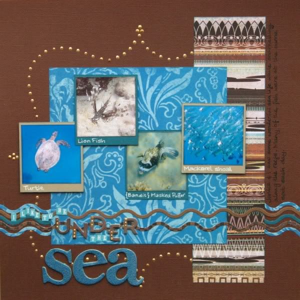
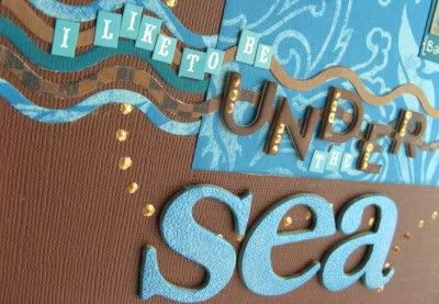
I've inked and covered some extra bare chip alphas from my stash for the title, but the tiny alpha stickers are from my kit. There are no apostrophes in the set so I went with "I like to be" rather than "I'd like to be" - I'm a proper punctuation kinda girl!
 |
| Photos courtesy of my fellow holidaymakers - thank you |
The "waves" are cut with a Sizzlit decorative border die and I used a template to place Liquid Pearls in a fancy shape across the page. Don't tell, but part of the photo positioning was determined by a smudge of the thumb!
Well, I cut into the final sheet of paper from my Counterfeit Kit tonight - it is now officially a pizza box full of scraps!. I reckon there's one more page in it before the card-making begins!


This is AWESOME!!! I loveeeeeee the photos, the colors and all the pearl dots!!! Thanks sooooooooooo much for playing along with Sketchy Thursdays! :):):):):):):):):):):):):):):):):):):)
ReplyDeleteWhat a pretty page!
ReplyDeleteWoaw! I'm gobsmacked by that liquid pearl work. Nicely done!
ReplyDeleteIt's okay - I knew what you meant this morning and I do agree. I love to create a different mood or feel on each page. Karen's theory is the opposite and I'm intrigued by it - she believes that if you decide on a few methods which work for you and then concentrate on those everything is faster and easier. I'll see how it goes! But thanks for coming back :)
if you like sketches, you can always join me at www.twistedsketches.com
ReplyDeleteWe do some great stuff too! And I think my next LO is gonna combine my Counterfeit kit with the Twisted sketch!
Kate
What a fun mix of papers! I like the feel of this page!
ReplyDeleteBethany
Love the colors and the Liquid Pearls look fantastic.
ReplyDeleteTFS
Ang
The colors are fantastic!
ReplyDeleteThis turned out great! I love the colors, the layering, and the pearls!!
ReplyDeleteSuper Duper page and perfect pearly placements there too.
ReplyDeleteLove those colour combinations of blue, green and brown ...
ReplyDeleteThis is a great design! And those Pearls are fantastic!
ReplyDeleteThis is gorgeous and thumb smudges are good design aids ;)
ReplyDeleteyour waves are so perfect for this page
ReplyDeleteI really like how you did your own dots and the waves are awesome. The names uder your fish was a great idea.
ReplyDeleteyou did a PERFECT job with the liquid pearls! Looks awesome! I love the look of this layout!
ReplyDelete*meridy*