It's time for another Counterfeit Kit Blog Hop and I'd like to welcome you aboard from Glinda's place (if you just happened along from somewhere else you may like to start at the beginning back on the CKCB).
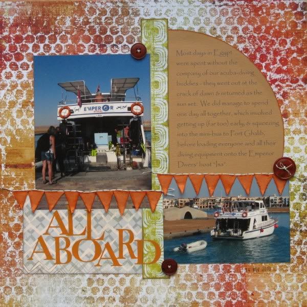
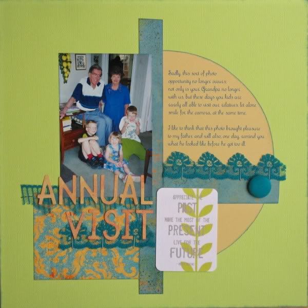
This month's blog hop challenge was to use our kits to counterfeit one of our own pages, so I had a little look through my albums and decided to have another go with a page from last September (which completely coincidentally uses some of the same papers from last month's counterfeit kit!) based on Twisted Sketch #66.
I'm still ploughing through photos from last November's Egyptian holiday, and decided to add a second photo rather than a journalling card. The use of patterned paper instead of card as the background also changes the dynamic completely.
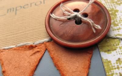
I was also joining in with a challenge on UKS which meant I needed to use scraps, add some bunting and a stamp too. I'm not really a fan of the bunting-on-every-page-trend, but I reckoned it was acceptable on a page about boating. My bunting is made from triangles of scrap cardstock - I was distressing the edges of each triangle with scissors when they started to come apart revealing a suede-like inner surface which I rather liked, so each trangle made two flags!
Thanks for stopping by - if you want to see more counterfeiters' in action then pop over to Gabrielle's blog to see what she has scraplifted with her kit.


So cute! Love you button! :)
ReplyDelete- Jessica
Counterfeit Kit DT
Jemma perfect for both challenges. love that bunting and wow to the accident that made the bunting perfect.
ReplyDeleteit's a great design and the pp background is super! love it
ReplyDeleteGreat job!! Your pictures really stand out on the new lay out!! Really nice!
ReplyDeleteLove both old and new layouts! The bunting is the perfect accent for your subject, and that suede-y finish is awesome! What a happy accident.
ReplyDeleteyour Lo would make a great sketch sorry to have missed the blog hop this month but will try harder for next time!
ReplyDeleteI love your scraplift-and you're right, the patterned background really does change the look of the page!
ReplyDeleteI am loving how different the two pages look - it really emphasizes what a useful trick scraplifting yourself is. I really am going to try and join in next month.
ReplyDeleteI can see why you would want to scraplift this design - love all the shapes colors on both layouts!
ReplyDeletelove the new Lo- the button is cute but I do like that journalling spot on your original page
ReplyDeleteLove em! The button is so fab!
ReplyDeleteLove the new LO - I know what you mean bunting seems to be everywhere at the moment.
ReplyDeleteGreat layouts. The sketch/design is really fun.
ReplyDeleteTFS
Ang
Great layouts! I love that patterned paper on the boating one!
ReplyDeleteGreat job - I like the way you really kicked up the color.
ReplyDeleteYou're right, the patterned paper instead of cardstock really changes it, but definitely for the better. Love the bunting too...and it goes well for a layout about a boat. :) Used in moderation it still makes it fun! :)
ReplyDeleteLooks great - this counterfeit kit sounds really good. I have so many- ahem- kits bits I really ought to give it a try next month.
ReplyDeleteBoth layouts are fabulous, but I really love the distressing on your latest one! Also good to finally find your blog after occasionally seeing your face pop up in posts on UKS :)
ReplyDeleteI think the bunting looks great!
ReplyDeleteYour scraplift is so fun and vibrant! I love the bright colors you chose!
ReplyDeleteLove that you traded the journal card for a photo. The flag border rocks!
ReplyDeleteSuch a great layout! I love the second photo addition and the fabulous background paper.
ReplyDeleteI LIKE IT!
ReplyDeleteGreat LO Jemma. Love how the bunting turned out. :D
ReplyDeleteGreat job. The little difference in the layouts are great, I love when you have the option for one or two photo, etc. This is a great go to layout!
ReplyDeleteHow delightful!
ReplyDeleteI just found your blog and am now a follower. So very nice to meet you! Stop over to my blog sometime and say hi!
http://lillianchild.blogspot.com
those little flags did distressed nicely...funny how a project leads you rather than you lead a project
ReplyDeleteGreat LO's, and thanks for the link to the sketches blog. I could sure use some inspiration sketch wise!
ReplyDeleteThe bunting looks great on this page - just right!
ReplyDeleteI hear you on the bunting but have enjoyed using it a couple of times. The texture on those flags is lovely tho - what a neat discovery.
ReplyDeleteGreat job on the lift!
ReplyDeleteNice layout to copy...I really like them both.
ReplyDeleteThe overall look is so similar but the feel of each is so different.
Great job.
I love how great things are discovered accidentally. Awesome life of your own work!
ReplyDeleteLove the banners as border idea, and the bubblewrap background is gorgeous!
ReplyDeleteGreat idea to use an old layout as a challenge. I really love the banner.
ReplyDeleteClever - love the 'suede' bunting! xx
ReplyDelete