 Back in May, just 3 days after my surgery, I donned bubble wrap around
my elbow (!) & braved the drizzle and the crowds to watch the
end of the torch relay in Crewe. I'd picked out a good spot which
gradually got worse and worse as the marshals failed to stop the crowd
standing in the road rather than on the pavement. Just before the torch
bearer arrived I gave up and moved up the road, away from the crush ... ending up with a prime spot to view the flame safely being transferred to the lantern.
Back in May, just 3 days after my surgery, I donned bubble wrap around
my elbow (!) & braved the drizzle and the crowds to watch the
end of the torch relay in Crewe. I'd picked out a good spot which
gradually got worse and worse as the marshals failed to stop the crowd
standing in the road rather than on the pavement. Just before the torch
bearer arrived I gave up and moved up the road, away from the crush ... ending up with a prime spot to view the flame safely being transferred to the lantern.Perfect for an unobstructed photo or two!
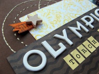
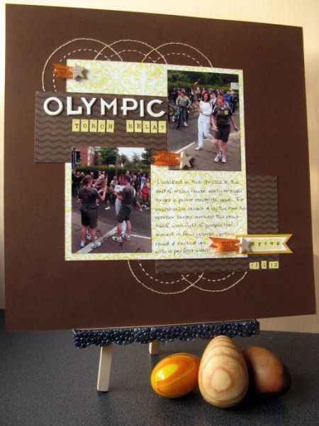
Here they are on another page made with October's Counterfeit Kit at my recent weekend retreat: quite a different vibe from my holiday pages as I've used two of the "B" sides. There's also more hand-stitching using a circle template printed onto acetate.
This month's second challenge at the CKCB was to get creative with photographing a project. I toyed with patriotically breaking out the Union Jacks, but decided that some wooden eggs would complement the colours and textures of my page rather better. It certainly makes a change from laying my pages on the floor and standing over them to photograph them without distortion. How do you photograph your pages for your blog?
P.S. If you love the CKCB as much as I do why not think about joining the Master Forgers

What a perfectly balanced page this is - from the photo arrangement to the Olympic circles and the little collections of ribbon and tags. Lovely to look at!
ReplyDeleteGreat page. you brave girl...your elbow and bubble wrap facing the crowds! Well done!
ReplyDeleteLoving those circles, great page x
ReplyDeleteLove the page....I must scrap my torch photos as well.
ReplyDeleteI tend to photo my pages on the floor....the light in my house is terrible!
i adore your layout with the stitched circles. so symbolic and just giving your whole layout that added extra. perfect. and your staging is really wonderful. unexpected but working so well.
ReplyDeletei don't usually stage my photos and have yet to discover where to take photos of my layouts in the new house, but i realy need to lift my efforts after seeing what you guys have done.
The stitched circles are such a perfect finishing touch - they give your page that special something, the charm that makes you want to go back and have another look.
ReplyDeleteQuite recently I changed from photographing my pages with props (which I'd been blogging for about 2 1/2 years) to doing the simple square crop thing instead. I thought it was interesting that I didn't get a single comment on the changeover!
Love it, Jemma :) We found the same problem with seeing the torch - a friend of ours had got there really early because he has mobility problems, set up a portable seat at the front, and waited patiently. More and more people arrived, and they started spilling out onto the road and in the end he couldn't see anything :(
ReplyDeleteAs for photographing layouts, I've never been completely satisfied with how I do it, having tried both ways! This looks lovely, though :)
I love your props, the 'distortion' isn't important imo, because the styling is so clean and clearly thought has been given. What I dislike is distortion when there is all kinds of detritus in the background, and my pet hate is page protectors, ha ha.
ReplyDeleteOh, and the layout is delightful.
E
xx
Love your hand stitching and the layout is beautifully photographed!
ReplyDeleteGreat pictures and great page!
ReplyDelete"laying my pages on the floor and standing over them to photograph them without distortion" made me laugh! That's about it, though. Mine is my outside patio, but it has been either too windy/rainy/dark to take many pictures in recent weeks.
I take shots on horizontal spaces that aren't too badly lit/cluttered. Sian - I noticed but as long as I can see the page I don't mind :)
ReplyDeleteGreat looking page!
ReplyDeleteLove the richness of color on your layout and way you have photographed it plays that up!
ReplyDeleteIt's a great page Jemma...and I DO like the way you've staged it..I'm a bit fed up with standing over mine too!
ReplyDeleteAlison xx