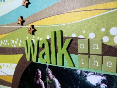
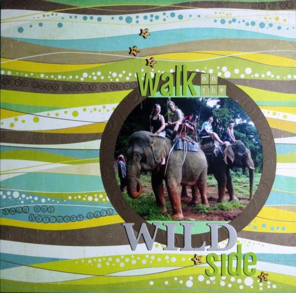
This month we had a choice of three challenges to use for the hop (#1 Subway Art, #2 Containers and #3 Stamping On Patterned Paper) and having cheated slightly for #3 by not using my January Counterfeit Kit, I promised to return with a page which did use the correct supplies.
I chose a photo from No.1 Son's holiday to Thailand last year along with the January sketch by Lizzie Hill over at Purple Pumpkin and got creating at my monthly crop. I generally copy sketches into my notebook and use that while I'm scrapping. Unfortunately this often means that the finished product and the original sketch bear very little resemblance! In fact, when I was grabbing the sketch link for this post I thought I must have made a mistake because the similarities are very hard to see!!
The extreme divergence is partly due to me reversing the sketch and partly choosing a circular frame for the photo to blend in a little more with the wavy lines of the paper. I did keep some of the stars and half the title placement though :-D
Anyway, back to CKCB Challenge #3: rather than cover up that beautiful paper with stamps, I've chosen to add my "who", "where" & "when" by stamping straight onto it ... scary stuff!
I think the secret to stamping directly onto your page is to:
a) plan out exactly what it is you are going to sayThere's just one more blog to visit this month (Leslie) and if you've missed anyone on the CKCBMBH you can find the full list over on the Counterfeit Kit Challenge Blog - why not join in yourself next month?!
b) practice on a scrap of paper so that you know how much space you need
c) not worry too much if things go wrong (which they did ... twice)!


Love this Gemma... stamping on those wavy lines takes guts! Good on you for getting it so well lined up.
ReplyDeleteLove those wavy lines and careful atamping - looks about as easy, though, as riding as elephant!
ReplyDeleteI love stamping but always have to hold my breath when I attempt things like this on a page. Great look!
ReplyDeleteJust a lovely layout :) I agree with your secret to stamping directly once you get over the worry it can be alot of fun :)
ReplyDeleteso subtle but soooo effective! go you for stamping directly onto the page - yes, scary and no, I don't think I'd trust myself. You really took that sketch and made it a Jemma page - love how you do that
ReplyDeleteI like the photo treatment and the stamping is nice too. Well done on making the sketch your own ;)
ReplyDeleteLove how you've stamped here Jemma, just looks like part of the paper design - it seems you are the final stop today!
ReplyDeleteJemma this layout is awesome.Sketches are all about changing them to suit yourself.Great initiative there!
ReplyDeleteGreat title, and that deep cocoa colored embossed paper as a mat gives such exotic mystery to the photo. Perfect choice of alpha stamp for the bubbly background paper! So brave to stamp directly on the paper! I always "condition" the stamp with ink by stamping a few times on a scrap piece for more even coverage.
ReplyDeleteThe circular frame was a perfect tweak!
ReplyDeleteThis made me giggle, as even though I'm the one who created the sketch, I do EXACTLY the same when I'm creating...so often I'm saying on my blog...you CAN see the sketch, you just gotta look hard!!!! all good, I say, sketches are 'jumping off' points!!! LOOOVE that paper & your stamping is fabulous!! Circles...eek! I steer clear of them...yours looks perfect - thanks for joining us at PP:):):)
ReplyDeleteWhat an awesome way to get more words on the page - by stamping them! This is an eye catching page - thank you for sharing! :o)
ReplyDeleteHi Jemma ! Well for some reason I can see the sketch but not the page, how frustrating! Maybe due to the wifi on the train ... I will be back :o) fab sketch though!
ReplyDeleteGreat layout. Your stamping looks like part of the do.
ReplyDeleteWhat a fun page and indeed a creative translation of the sketch, lol. Love it when that happens, it happens to me too a lot!
ReplyDeleteThanks for joining us at Purple Pumpkin this month!!
oh Jemma..i love what you've done with the sketch. A super page x
ReplyDeleteGorgeous layout and wow what a great photo
ReplyDeleteThe circular photo works perfectly with those wavy lines. Keeping it simple to showcase that paper was definitely the way to go. Love that LO. And btw of course you're welcome to scraplift - but it was only a grid.........
ReplyDelete