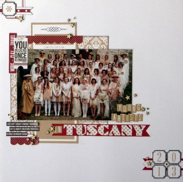
Time for another scrapbook page made with the lovely Teresa Collins "Hello My Name Is" Collection. For this one I used the March sketch inspiration from UKScrappers along with a photo of Child No.3 and her fellow G&T artists in Tuscany last year
Part of their pre-trip preparation was to make Renaissance-painting-inspired outfits and one of the highlights of their week was when everyone dressed up for a photo shoot in the Tuscan castle they were staying in. I've added some gems, veneer stars and used Man O Man Sizzlits for my title.
You can read how I started using this collection here on the S J Crafts Blog (and while you're there why not check out their April Challenge ... there's a prize!).

I really like the way this spills out and down across the page, and the sharp contrast of colour are great with your photo. Don't they look splendid?
ReplyDeleteGorgeous layout Jem, the colours go so well with the wonderful outfits.
ReplyDeleteReally lovely, you've done that fabulous photo a great justice
ReplyDeleteGreat page. I do love the colours of this collection and the wooden stars finish it off perfectly! I've pinned it too! x
ReplyDeleteThat's a great photo and you've made something special with it. I bet Child No.3 is pleased with the souvenir. Fun that they all made outfits in white and/or gold - it's all very colour-coordinated!
ReplyDeleteNice that you have made a special page for your daughter - does she have her own "album" of memory pages? (made by mum!)
Love the red with the gold and such a cool pic!
ReplyDeleteOh that is a such a cool picture and I like the way you've clustered around the edge to make a frame. Great GBS quote too.
ReplyDeleteI take it that G & T is not gin and tonic!!
ReplyDeleteLove how well those papers go with the photo.
Great layout, love the colours.
ReplyDeletelove that page. the papers are perfect for the photo.
ReplyDeleteWow! That looks like a fantastic trip and a great page to document it. When my boy went on his G&T Art trip it was to the Pitt Rivers museum in Oxford. Not quite so exciting!
ReplyDeleteTheir outfits are fab and I love the colour scheme you have used - great layout
ReplyDeleteFabulous page Jemma, love the clean look and the simple colours :)
ReplyDeleteOH my that's a fabulous layout I love the overall colour scheme, clean and very elegant!
ReplyDeleteA gorgeous page!
ReplyDeleteSue x
This is a lovely page - I really like all the little bits & pieces you used! And what a great photo with all of them in fabulous costumes!
ReplyDeleteI'm loving the colors of this collection. And your page is just so pretty.
ReplyDelete