Holidays are always something of a compromise. You cannot please everyone all the time.
We've always found it best to make sure each person has free choice with one activity and everyone else does their best to make sure that it's a success.
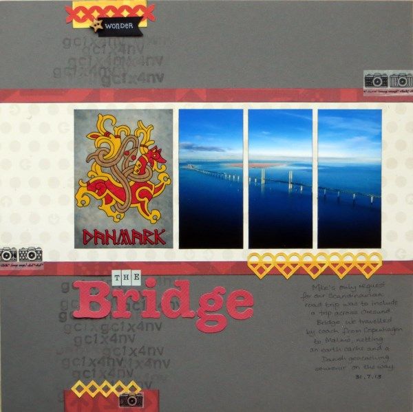
Last year's Scandinavian Road Trip holiday allowed me to attend a 30 year reunion with colleagues ... and of course, having worked there, I had plenty of ideas for what I wanted to do. Hubby had just one request: to travel across Øresund Bridge between Copenhagen and Malmö (we are BIG fans of Scandinavian dramas on BBC4).
We discovered that it was accessible by car (very expensive toll charges), rail (affordable, but you are travelling on the suspended lower level of the bridge) and bus (cheap and we could both enjoy the view). We chose bus! Crossing the bridge also enabled me to claim an earth cache (GC1X4NV) which resulted in a geocaching "badge" for Denmark as well.
Having avoided hearts when counterfeiting my February Kit I'm quite surprised to see hearts on both pages made so far ... my MS deep Garden Trellis punch makes lots of fun borders! The title alphas are cut with Sizzlits Round-a-Bout dies and the Versamark stamping uses Banana Frog Tiny Teen stamps.
I took inspiration from the February Sketch from S J Crafts as my starting point ... which is itself based on a lovely page by fellow S J Crafts DT member (and former Master Forger at the CKCB) Jennifer. S J Crafts have a linky on their blog if you fancy using the sketch too - it's open until February 28th - and while there may not be prizes, Sarah will be picking some projects to feature on the blog, so do please join in.
Actually, strike that! There WILL be a prize, because I want to celebrate joining the DT at S J Crafts, and I'll donate a little something ... to a randomly chosen S J Crafts-sketch-user-and-linker-upper ... anywhere in the world!
Winner announced ... here!!


I love that layout and how you've used the photo(s)
ReplyDeleteNow that I'm watching The Bridge, I feel like I've been there too.
Congrats again on the DT :)
Really like the design you've used and the colours are so nice against that grey. Yeah for buses and getting to compromise.
ReplyDeleteBeautiful layout and love the story behind it
ReplyDeleteFab page - love how you've divided the photos Jemma. So excited to have you on board the S J Crafts team and what a fab start you've made with this sketch! A prize too .... THANK YOU so much!! xxx
ReplyDeleteLove how you've cut the photo up.
ReplyDeleteGreat layout Jemma I love the little bit of random stamping you have done under the title lovely to have you on the S J Crafts DT.
ReplyDeleteJenny x
What a really neat cache to obtain!
ReplyDeleteLove how you've divided up the photograph!
ReplyDeleteAlison xx
Loving the division of the photo and the background to the same - awesome stuff!
ReplyDeleteOh, wow! Would you believe I have a page about this very bridge on my desk at the minute. Because I took photos when we were there I decided to do a layout about the Crime Series we have been enjoying on Saturday nights. Okay, I'm going back for another (inspirational) look at your brill page now...
ReplyDeleteThis is gorgeous.
ReplyDeleteC xx
Wow Wow Wow just love this layout and the take the picture is so cool! The heart border is fun too
ReplyDeleteBest of both worlds on the bus - great choice! Makes a change too doesn't it. I like what you've done with the sketch!
ReplyDeleteI love your interpretation of the sketch and how you used one photo x
ReplyDeleteI love the page and how you used three photos to show the bridge. Going by bus is a great idea, good views and hand frees for photo taking!
ReplyDeleteLooks great - I like the photo placement and then the yellow pops too. Really looks great!
ReplyDeleteThis is wonderful Gemma ...I never thought to punch a punch out! I have that punch so I'm off for a play! Coming soon to a layout near you!
ReplyDeleteGreat layout - I really like the colors! And how fun that you were able to cache in on the trip, too!
ReplyDeleteThat's a rather fab page Jemma! I love the contrast of the gold-&-red with the blue-blue-blue of the sea & sky on your photo. I also love how you have split it into three - somehow it makes that long, long bridge seem even longer.
ReplyDeleteBTW, when I crossed from Sweden to Denmark, in the 1980's, there was no bridge yet! We went by sea to Helsingborg, then by rail across Denmark to catch our ferry home.
Seems like your husband had a great choice for the trip. I love the colors and the scale of you embellies on the page. They really serve to highlight the photo.
ReplyDeleteIn the U.S., The Bridge became The Border, and it was a really good first season.
Rinda
Love the way you segmented the photo. So effective! Fabulous layout.
ReplyDeleteThat's quite some bridge - and all he more effective for being across three photos. I like your delicate lacy effects on the hearts too.
ReplyDeleteI love the span of that bridge across 3 photos. You have motivated me to do a layout.
ReplyDeleteThis is stunning! Adore the color scheme and your accents are perfection. Amazing photo - love how you divided it.
ReplyDelete