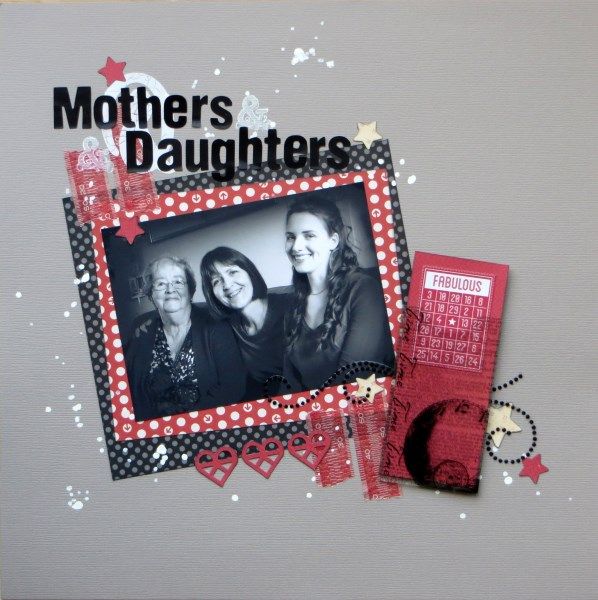
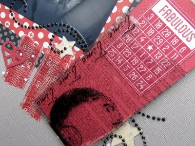
Those darned rub-ons in my February Counterfeit Kit aren't making me happy :-<
The first few I tried to use for a chalkboard effect, but they wouldn't stick on at all and are now in the bin.
Yesterday at my monthly crop, I opened up a "new" (i.e. un-opened, but probably quite old) packet to add a giant ampersand to today's page - and it worked pretty well. Unfortunately my stupid title positioning meant that you could no longer see that it was an ampersand - OOPS! So I stamped some ampersands onto the page instead. However, a day later and the alphabet stickers have lifted up from the page, bringing the rub-on up with them. Hopefully a little photo glue will solve the problem ...
This page, based on the (90° rotated) January sketch from Skissedilla had more problems during its creation: I was trying to use a white paint pen to highlight the obscured ampersand rub-on when it splatted white ink onto the photo (luckily I had a second print available) AND onto the cardstock! So the page quickly acquired a lot more ink splatters LOL - actually quite a happy accident in the end :-D
I've also used inspiration from the Weekly Challenge at UKS to use a B&W photo: perfect as for some unknown reason I looked like I'd been under a sun-lamp compared to my Mum and Child No.3!


A truly adorable happy accident :)
ReplyDeletewell the page looks pretty good to me Jemma so it all worked out well in the end! xxx
ReplyDeletei find them very temperamental...a great page x
ReplyDeleteThat sounds like such a lot of aggro - and yet it came out so well in the end! Isn't it funny (and gratifying) that these things can happen :).
ReplyDeleteThat's what I love about scrapbooking.. if something goes 'wrong' you can soon make it work.. as you did here. Lovely LO!
ReplyDeleteI certainly can't tell that page was problematic - the end result is very striking. Nicely finagled, Jemma!
ReplyDeleteLooks a remarkably lovely page for all the troubles and strife it caused you :)
ReplyDeleteGreat looking page! Sorry it gave you such troubles coming together
ReplyDeleteOne would never know you'd had a problem. Looks great. I really like those white splats.
ReplyDeleteBeautiful layout, all looks very deliberate :)
ReplyDeleteIt has come up beautifully.Love the photo and your page is great,especially the white splats.
ReplyDeleteLovely layout, no one would ever know that the splatters were not intentional. I too find rub ons tempermental.
ReplyDeleteI loved reading your post - though I'm sorry you had so many struggles the page turned out fabulous! The color combo here is so striking with that black and white photo and the splatters do indeed look marvelous! I must admit I gave up on rub-ons ages ago, LOL. Thanks so much for playing along at Skissedilla. :) Scarlett
ReplyDeleteWe wouldn't have known if you hadn't told us . . . I think you've covered your tracks well for a lovely page!
ReplyDeleteSuch a pretty layout :)
ReplyDeleteyou have my sympathy - most of my layouts have problems like this at some point or another! I usually don't manage to rescue them as well as you have here though. Nice job! The b&w photo really brings something extra to this design.
ReplyDeleteThis turned out lovely despite the little accidents!
ReplyDeleteI learned a long time ago that not all rub ons are created equally, and I now tend to avoid them.
ReplyDeleteRinda
Oh that's utterly gorgeous!
ReplyDelete