
... when I spotted that there is some beauty out there - you just have to get up close.
 Last month I wrote that I was half way through our Book Club choice: Louisa Young's "My Dear, I Wanted To Tell You" and I am happy to report that the second half was as beautifully written as the first. Young gives an appallingly clear insight into the experiences of the soldiers both on the front line and on leave. Equally movingly described is the strain of waiting at home on the soldiers' wives and girlfriends. Some tried to cope with housework and shopping: in a constant, numbing state of readiness for their loved one's return. Others found that work was a welcome distraction, paying forward nursing care to soldiers. Soldiers' injuries were often appalling and the book describes pioneering facial reconstruction techniques in heart-rending yet interesting detail. The characters and plot kept me engaged right to the end; a thoroughly good read.
 My sister in law knows that we are big scandi-drama fans here and insisted on lending me her copy of "The Killing" by David Hewson: a novel written from the screenplay ?!?!? Luckily I had forgotten much of the plot of the series which was shown on BBC4 in 2011, although I could remember who did it! The novel explained the political shenanigans better than I remembered from the TV series. Both lead you up the garden path on the trail of red herrings (mixed metaphors, sorry) but there is an extra, very clever twist at the end of the novel that went beyond the televised finale. I was pleasantly surprised in the end and may have to borrow the novelised sequel from my sister in law to see if Hewson can pull it off again.
 I grabbed my next book from our shelf of ex-library/bargain bin/gifted books: Robert Goddard's "Sight Unseen" promised a thrilling mystery set around Avebury. Having visited the ancient stones just last year, I was initially immersed in the description of a child's sudden kidnap and the efforts of a retired policeman and a witness to find motive, perpetrator and victim. However I became less and less enamoured of the story as the action flitted from Avebury to Prague to London and Jersey and the originally impecunious witness paid for plane tickets, car hire and hotels as if money was no object. Overly large amounts of historical research and improbable plot developments left me bored and frustrated respectively. In fact I'm convinced that I've come across at least part of the plot before in an episode of Bergerac or some other TV series/film ... I wonder which came first?
 My nearest library didn't have a copy of our March book club choice so I grabbed randomly from the "new" books shelf. John Grisham's "The Brethren" looked like an interesting read: prisoners working a blackmail scam from inside a prison hook the wrong fish. It started well with an engaging account of a prisoners' court dealing with internal grievances, introducing the scammers. However, after successfully blackmailing a few unfortunates, they target a man being groomed by the CIA to be the next president of the United States. What might have been an exciting will they, won't they story was overwhelmed by the machinations of presidential campaigning mixed with unpleasant activities involving the CIA. There were several odd interludes that had no purpose that I could fathom and the ending left me pretty cold. The first Grisham novel to let me down :-(
 It was therefore with some trepidation that I started on another random library choice: "I'm The King Of The Castle" by Susan Hill. Although it was on the "new" shelf, the book was originally published in 1970. The story describes the unhealthy relationship between two ten year old boys forced into companionship by their parents during their summer holiday from boarding school. I was entranced by Hill's depiction of the psychological bullying perpetrated by one boy on the other and appalled at the inability of the parents to notice their unhealthy relationship. Packed with symbolism, the novel is a real page-turner as the victim's torment ebbs and flows but steadily increases towards the tragic climax. A very unsettling read; I can fully understand why it has been republished as a classic of its decade.
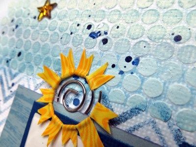
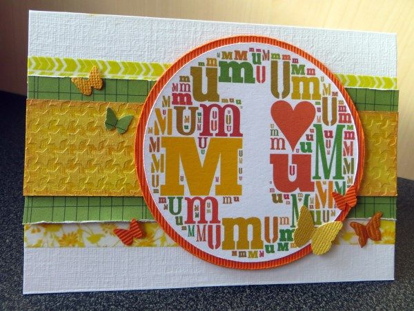
 The Counterfeit Kit Challenge Blog had a challenge to add texture to your background which needed doing. I also wanted to have a go with Scrap 365's March sketch and wondered if I could replace most of the layers of paper with layers of texture paste and ink ...
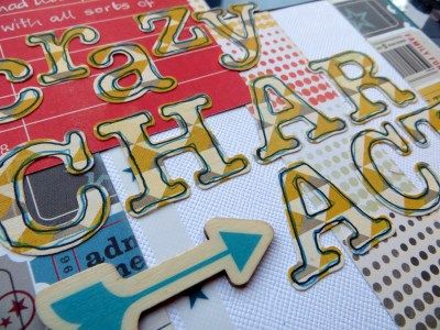
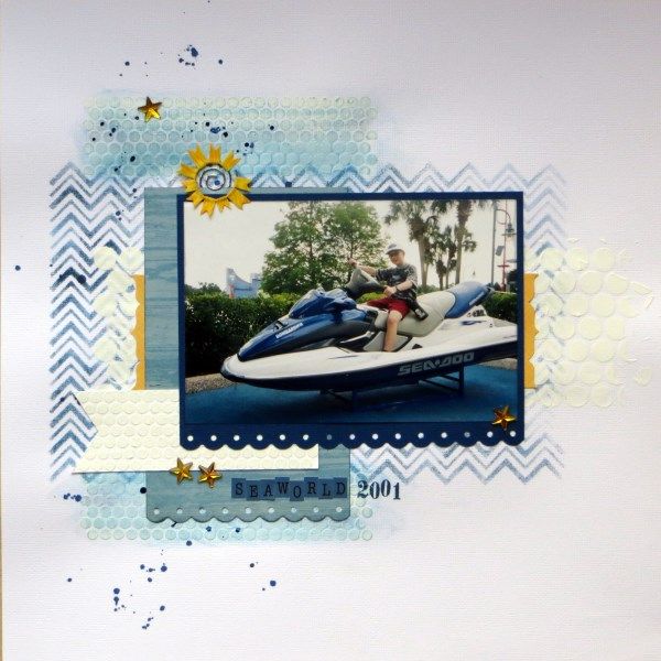

 so I decided to combine texture with my favourite on-line tool: Tagxedo.
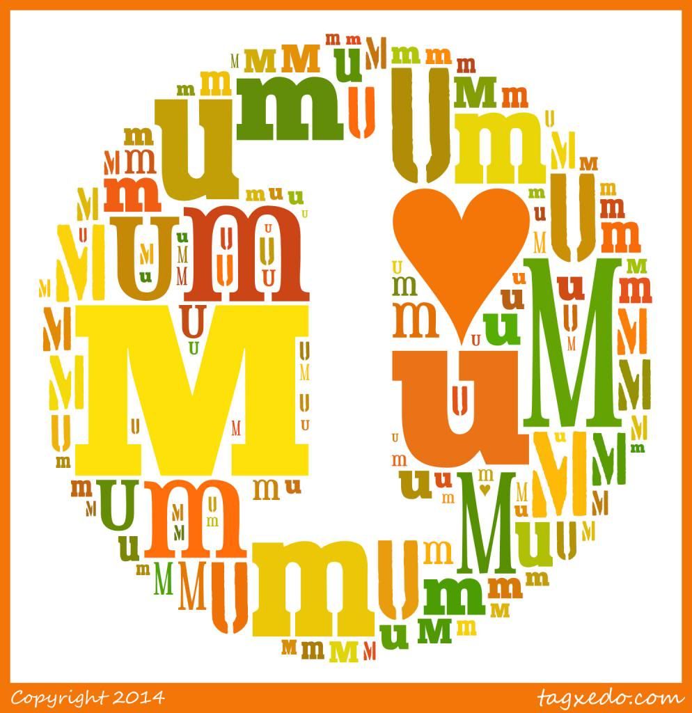
Theme = Pi PaletteMy Word Options were:
Font = a few of the ones I like best (deselect unwanted ones, including Wingdings2!)
Orientation = Horizontal
Remove Common Words = No (for small words like “a”, “is” and “it” ... and "m" and "u"!!!)My Layout Options were:
Combine Identical Words = No (so that "M" and "m" aren't treated as one item)
Max Word Count = 150 (stops the letters getting too small - for printing out reduce it further)I messed about with Layout, Colour, and Font Respins until I found a combination that I was happy with - utilising the History to see thumbnails of the variations - before using Save ... to get an image onto my computer.
Allow Replication = Yes (to fill the shape without typing "M", "u", "m" repeatedly)
Font Preference = All (the ones I have selected)

 |
| {click on the picture for a larger view} |