Welcome to the second of January's challenges for the
Counterfeit Kit Challenge Blog. This one was to add glitter, bling, sparkle, pizazz to your project! But I had nothing glittery in my
January kit - so I had to improvise in the way that we counterfeiters do LOL!
I took some unloved brads, and a beautiful, but not-the-right-colour star-shaped brad from
Susanne's swap packaging and got busy with VersaMark ink, some glittery embossing powder and my heat gun:
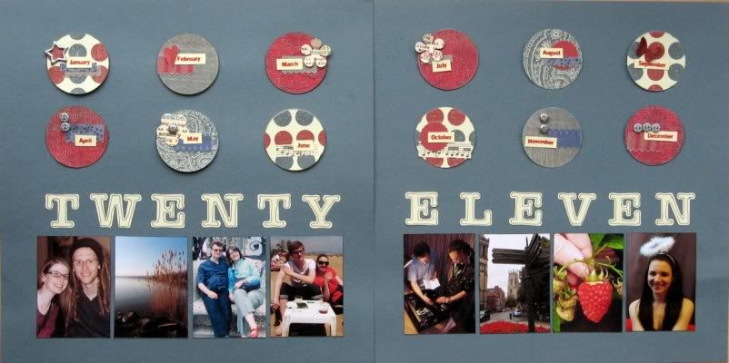
Transformation complete, I set to work on my page. Remember how I
failed on my JYC? Well I also gave up on my 2011 Project 12 after only 2½ months! Which was a shame as I
love my Project 12 album from 2010, and I
love the year in review hidden tags I did for JYC 2009 and
JYC 2010. So I decided that I'd do a double page summary for the year, based on
a lovely sketch over at
Scrap365 magazine's website.
The year was a bit hit and miss with photos (hence the Project 12 fail so early in the year) so I couldn't find one decent photo for every month. Instead I made sure we were all on there with a couple of feature photos representing some of our year's activities.
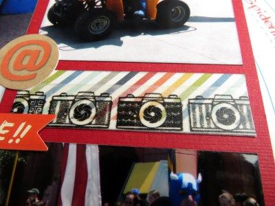
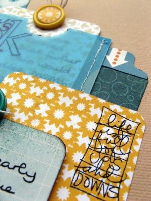
I had fun decorating each of the circles at the top of the tags - with snippets of my counterfeited Pink Paislee Mistable Ribbons, some of the contents of my counterfeited October Afternoon Flower Sack, a few buttons and the glitterfied brads. My month names are stamps from a Scenic Route set and the free font is
Veggieburger.
In my
January kit I had two ways for counterfeiting the mistable ribbons - fabric (strips torn from an old sheet) and paper (border punched tissue paper) - and I promised to let you know how I got on with them.
I haven't tried actually
misting on them (no mists LOL), but started by colouring them with two shades of Fiberscraps Tintz: dabbers which dispense a colour-wash a bit like very watery paint. Both took the colour well, but the tissue paper distorted and crinkled really badly as it dried. It took a while for the fabric to dry, but I used some of it on my
2012 goals page for the first CKCB challenge.
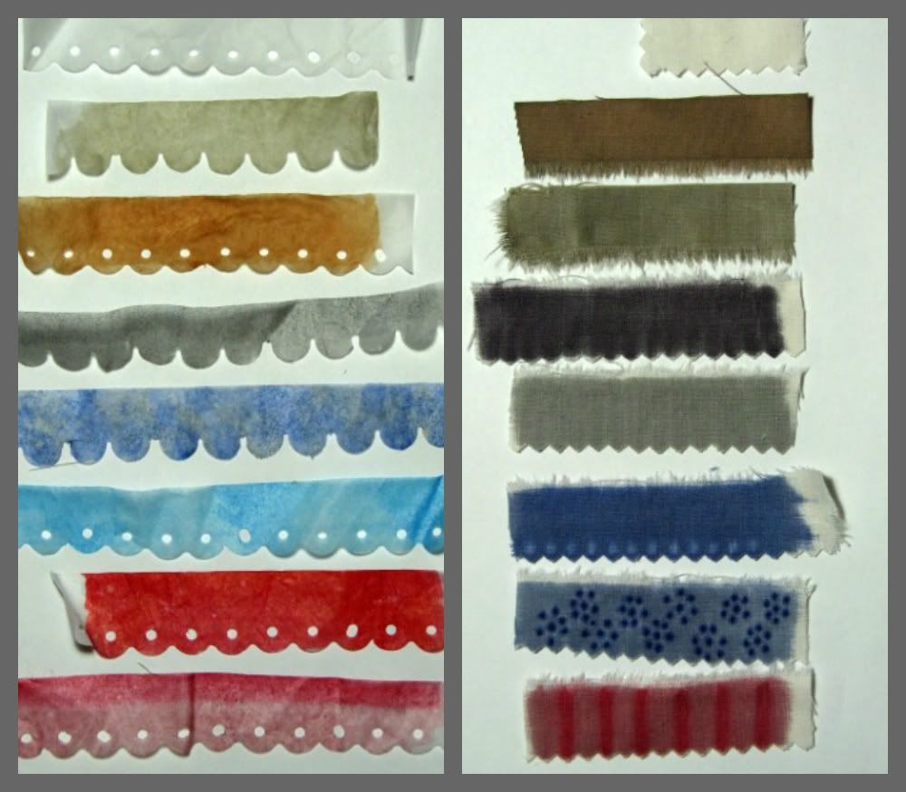 |
From top to bottom: un-touched original tissue or sheet strip
2 samples with Tintz
5 samples with Promarkers |
Then I tried Child No.3's Promarkers out on them with
much better results: a great range of colours with plenty of decorative potential using the blending pen and contrasting shades. Being alcohol-based, the ink dried really quickly and the tissue paper didn't crinkle at all. It does crease though - I'll have to get the iron out before using any of it! The fabric has taken on a starchy stiffness after colouring with the Promarkers - very different to the untreated or colour-washed samples.
On balance the fabric has worked better and if I had a die-cutting system that could cope with fabric my counterfeiting would be complete!
P.S. I haven't joined in with a Thirsty Thursday Challenge from
A Trip Down Memory Lane for a while, but I reckon I've covered
P for
Polka-dot,
Portrait
Photos and
Parents (that's us!)
pretty
perfectly ... as well as
R for
Red and
Review!
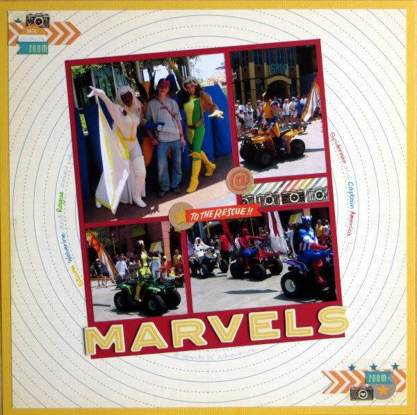
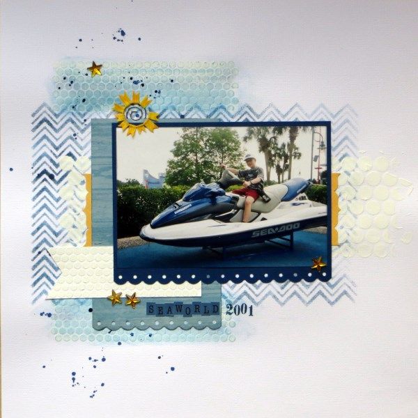
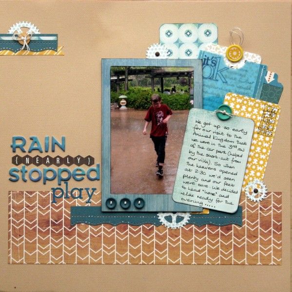
 My page started life using the May sketch from Scrap365 but the use of the Boys Rule Race Track paper in the background led me to titling the central block, Time Tunnel style ...which is more fun don't you think?


