Lisa recently asked the whole Master Forger team over at the
Counterfeit Kit Challenge Blog to define our scrapbooking "style" by answering a questionnaire. She mixed the style sheets up and supplied us each with the answers provided by another Master Forger. We were then challenged to make a page in the style of our secret swap partner. I was hoping I wouldn't be required to scrap with too much pink or florals or glitter ... and luckily I did manage to avoid all of those!
Today the Master Forgers are sharing the results of the style swaps and you may have arrived from
Dawn (especially if you started on the CKCB
here).
While I was waiting for my style swap partner's questionnaire I had a bash at scrapping according to my own answers:
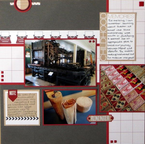
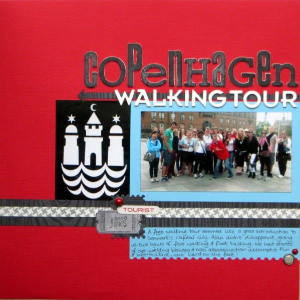
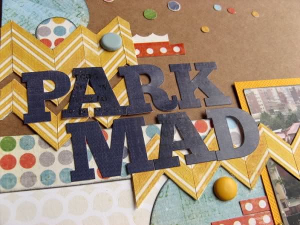
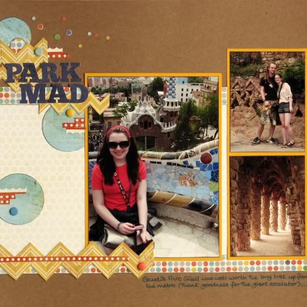
• started with a sketch
(#6 from
Scrapbook Generation's Travel Sketch Book)
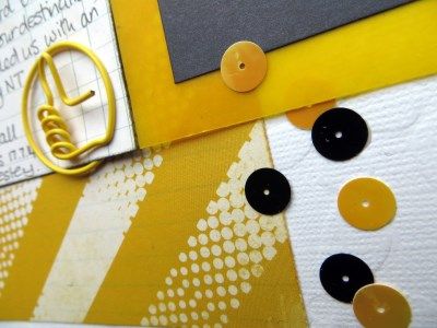
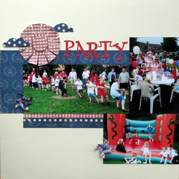
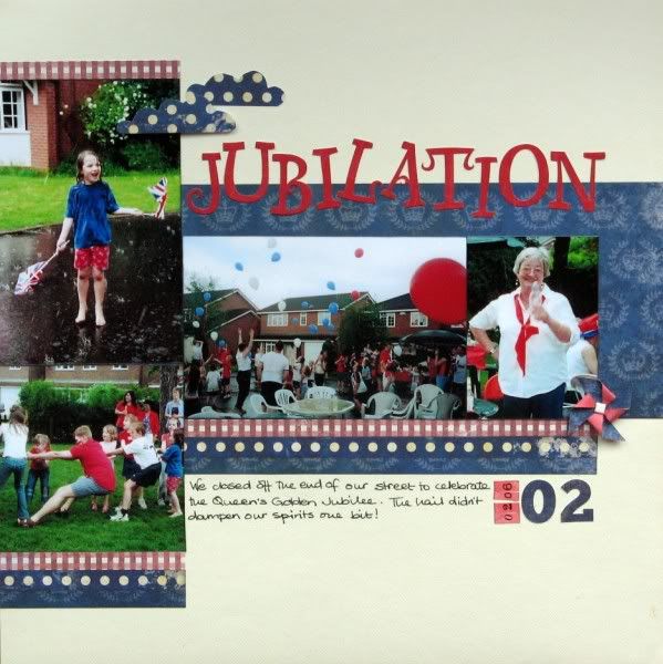
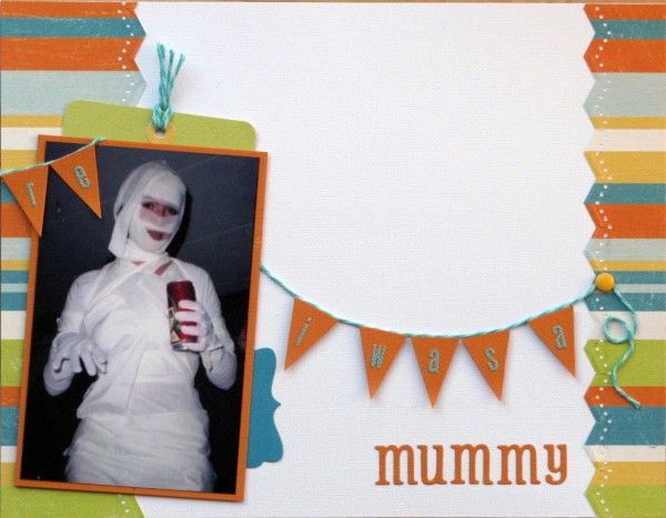
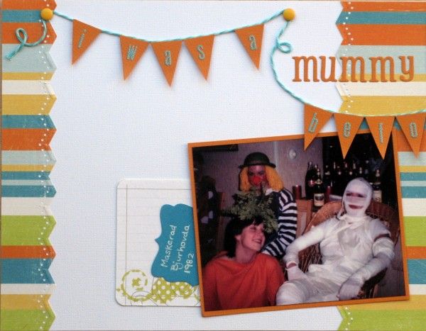
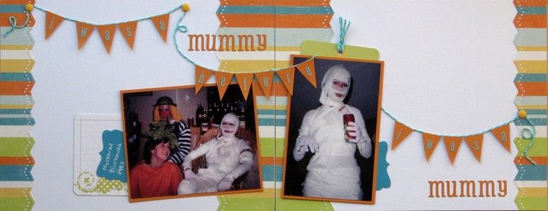
• used a colourful, cardstock background
• chose several event-themed, cropped, standard-sized prints
• stuck to straight lines and geometric patterns
• kept things clean & simple with no messy techniques
• placed elements off centre and used visual triangles
• distessed/sanded/
inked/torn/stitched edges
• used classic products from a variety of collections
(my
October Counterfeit Kit)
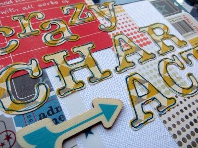
• mixed up my title letters and added handwritten journalling
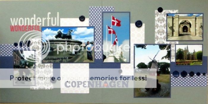
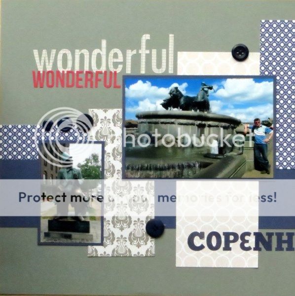
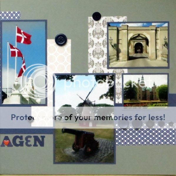
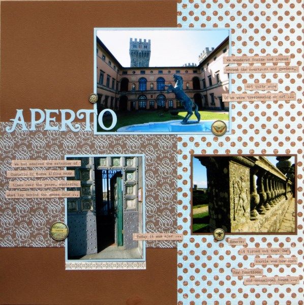
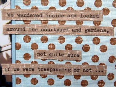
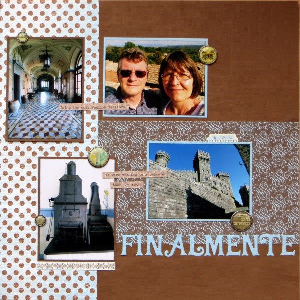
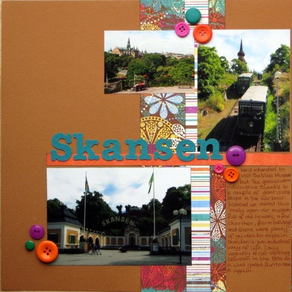
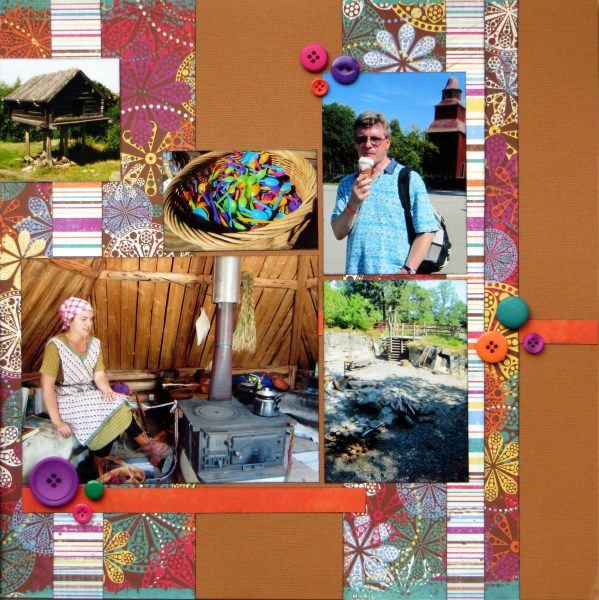
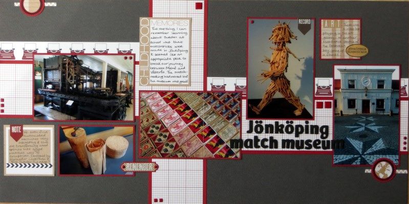
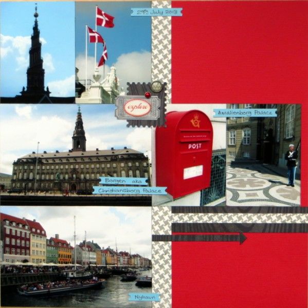
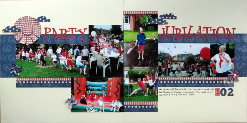
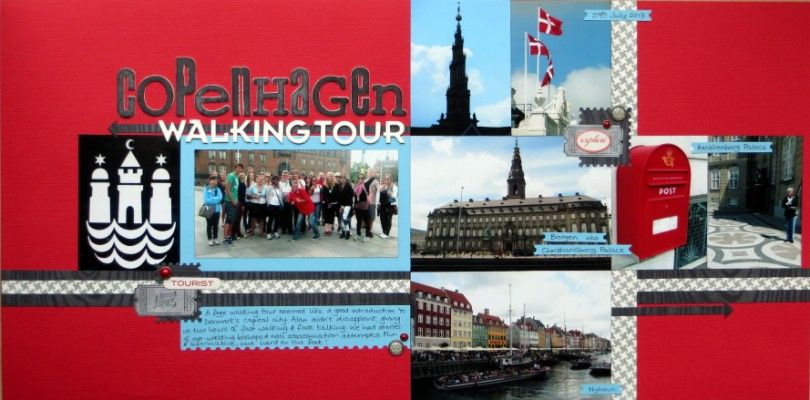
... and because I had answered that I occasionally do double pages (and that book of sketches is crammed full of brilliant ones), it seemed appropriate that there was a second page of photos from our free walking tour of Copenhagen this summer:
... making a double page spread that I recognise as mine, but is probably a little cleaner and simpler than most of my single pages thanks to the number of photos:
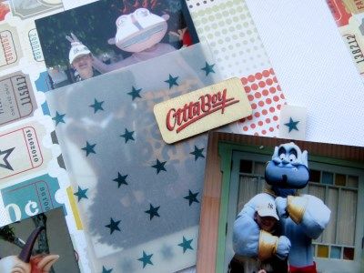
Then it was time to have a go with my style swap partner's answers:
• start from a single momentous, standard-sized photo
• use a neutral, patterned paper background
• feature clustered angles and visual triangles
• strike a balance between sticker sneeze and clean & simple
• centralise the main elements
• keep the tones muted with organic and girly patterns
• use classic products from a variety of collections
• mix up the title letters and add handwritten journalling
•
distress/sand/ink/tearn/stitch edges
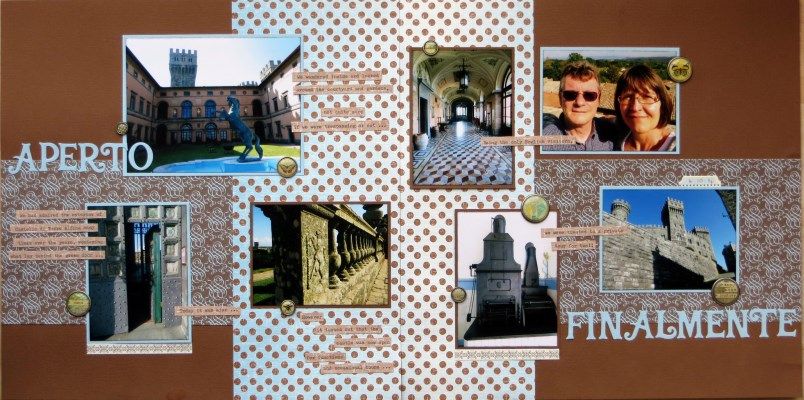
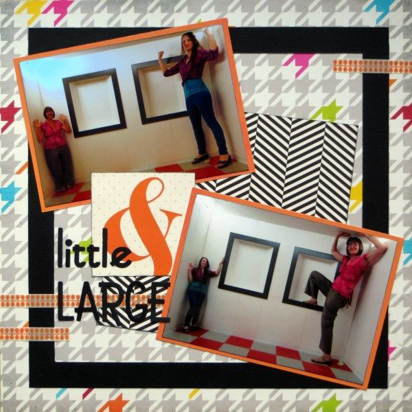
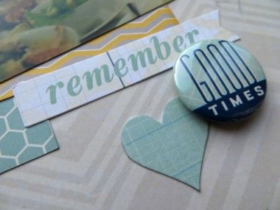
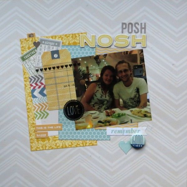
I think I managed most of the instructions: a single, cropped, photo from No.1 Son's recent holiday in Thailand, using muted papers and mixed-collection embellishments from my
November Counterfeit Kit along with a scrap of girly (?), swirly patterned paper. The title is made from two different alphabets but I have yet to add the journalling because No.1 Son can't remember the name of the restaurant they ate in ... I shall have to call his girlfriend and find out. To be honest, I forgot about the edge distressing and struggled with the angled clustering, but I really like the use of a neutral patterned sheet as a background and will definitely be trying that again.
Now all that remains is to guess just whose style I have counterfeited ... I was torn between
Lynette,
Milissa and
Stephanie because most of the other Forgers love getting messy with inks ... but I have to choose one, so I'll plump for
Milissa!
I wonder who
Julene was swapped with ...and whether she had trouble adapting her style?