HA!
I'm afraid that didn't happen, but I'm here today to resurrect my (also long neglected) "Five on Friday" theme and hereby present to you:
Five Fonts I Like to Hand-Cut

This is the same font as the Banana Frog stamps from the aforementioned page and it's great to print out directly onto your card or patterned paper. There are no fiddly middle holes of letters to worry about so it's easy peasy to do.
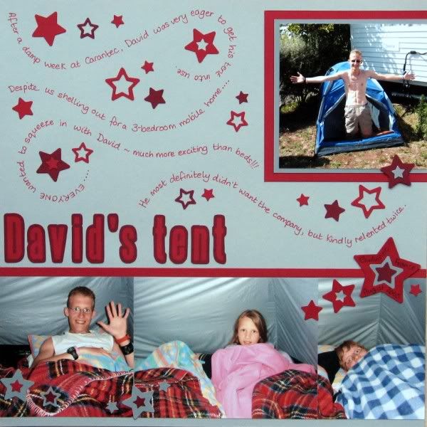

This also comes with a bold version that is the inverse i.e. coloured dots on a clear letter (with a coloured outline). Upper case only and you could just cut around the outside edges and leave the "holes" in place on letters like A B D O P Q R and even G.
The next three fonts can be printed out onto the front of your card or paper, but I tend to reverse them using my printer settings (or flipping them if they are in a suitable word processing package) and print them on the back of the paper or card, preferably in draft or outline mode to save on ink.

This uni-case font is a pretty close match to the one used by Basic Grey for many of their alpha stickers - great for adding a monogram to match.
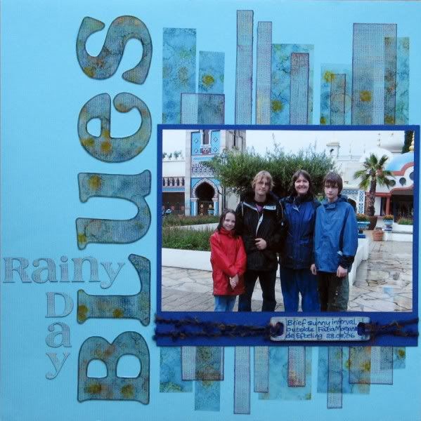

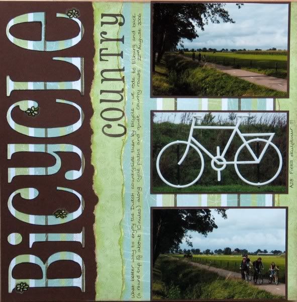
I love the flicks and curves on this font, but it's easier to cut if you choose upper case letters only. I'm told that cutting with a craft knife on a glass mat is the best way to cope with the more difficult fonts, but I generally manage with a combination of my Fiskars fingerblade on a normal cutting mat and the occasional use of curved detail scissors. Slow and steady wins the race - and if you snip a tiny bit too much off you can always reprint or stick a flower over the join (see below)!

I have the Banana Frog stamps to match this one too. The vowels come in upper and lower case variants with the rest of the letters being a mix of both. Cutting it out is a bit of a labour of love to be honest, but I do love it so I'm happy to labour! Make your title BIG & BOLD & SHORT to minimise your pain!
Do you like to hand-cut your titles? What fonts would you recommend?
