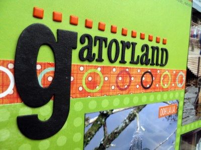
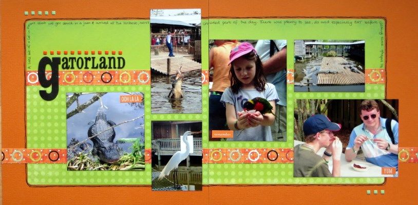
I've been creative with my April Counterfeit Kit to make another Disney 2004 album double page spread ... and use up a bunch of square brads from my stash! Inspiration came from Challenge #3's Spring theme and I met the challenge by matching the fresh and vibrant patterns and colours from my kit with some orange cardstock.
As I've been so bad at blogging recently, I'll share another page from the kit with a totally different vibe featuring a different tourist attraction and a more recent holiday:
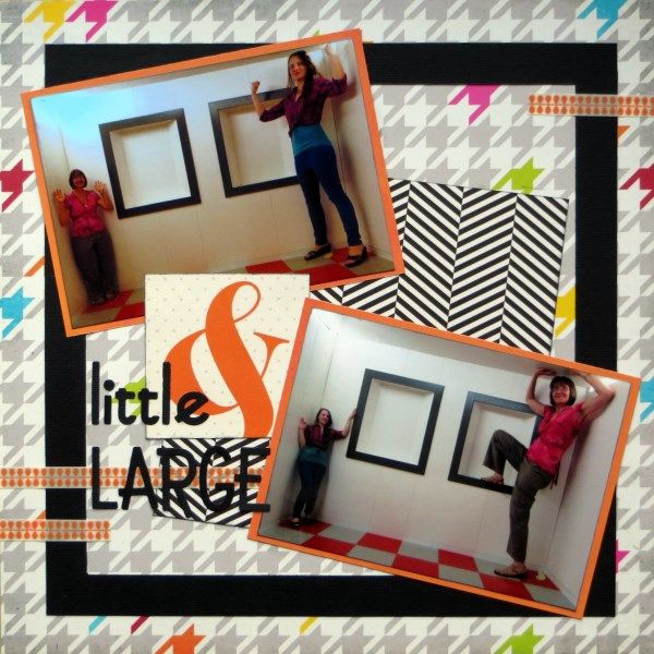
Edinburgh's Camera Obscura has 5 floors of optical illusions and amazing immersive entertainment! We took dozens of photos of all the madness there including these shots of Child No.3 & I playing with perspective! More black cardstock for my title, this time with Sizzlet Go Go Boots dies plus a little washi from my kit to separate it from that eye-watering black & white chevron pattern!
Next stop on the Members' Hop is the lovely Sherrie and you can find the full list of participants Counterfeit Kit Challenge Blog today.


16 comments:
Fab, bright layouts. Love the camera obscura one in particular.
I love both of these layouts Jemma.Well done. Link to 2nd one to Archiscraps,my blog, where the challenge is put something crooked on the page.
That B&W print is perfect for an optical illusion page. And I love the bright orange and green together.
Love the vibrant citrus look of the spring inspired page and the amazing pic in the 2nd LO. We were in Edinburgh last September but didn't visit the camera obscure, I really wish now that we had!
Terrific layouts! Wonderful use of the square brads. Super two page spread. I love the vibrant colors. Great idea for the alphabets too. The second layout is perfect, as well. I love the square inside the base paper imitating the boxes. I also love and the chevron paper with this layout -- so appropriate that it tricks the eyes a little. Every detail so wonderfully put together on these!
Love the bright fresh vibe you've brought to these pages, Jemma. And kudos on the brads!!
Great projects, love the way you used your square brads !
I love how lively and bright both layouts are!!
Fantastic layouts love the feel of the Disney Gatorland layout and what a fun place to visit in the 2nd layout so cool the effect of the photos
Double gorgeous! The first page looks like it came out of a scrapbook magazine - sigh - perfection! Love how vibrant & graphic it is with great detail.
#2 has that to-die-for houndstooth background but the crazy photos take the spotlight! #totallyFUN
Wonderful pages!! Love the colors. Great job!!
the optical illusion place looks like a lot of fun. Super pages Jemma x
Great line of brads on that gatorland layout and the camera obscura looks like a very entertaining place!
Am loving your orange and lime colour scheme and your perfectly lined up square brads on the first page, and how you've used that black and white paper on the second one to great effect!
Two great pages and that first one has such great colours. I'm SO impressed that you found such a good way to use all those square brads and that they are straight! Mine would have been all over the place!!!! Two really super pages .
That's a great two-pager, Jemma, and I like the way your photos break out of the frames in several places like that ... Super stuff!
Post a Comment