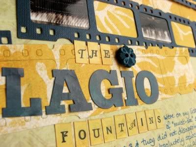
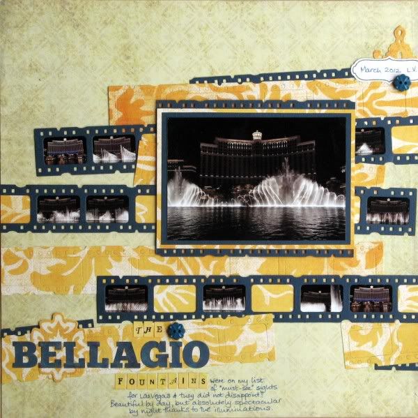
 The film-strip frames die was also used to add texture to some of my patterned paper; to stop the cut-outs from falling out I added double-sided tape to the back after die-cutting and used this to stick the patterned film-strips to the page. Everything is from my April Counterfeit Kit apart from the Echo Park blue title alphas which needed a little extra ink to make them tone better with the cardstock.
Have you been playing along with Shimelle's weekend crop? The deadline is almost upon us which is why I've linked this page there too - it ties in nicely with her 15th challenge - to scrap with less than perfect photos - by printing the blurrier ones really small you can appreciate the shapes made by the fountains without noticing the imperfections!

15 comments:
As always you have come up with a stunning and original page I love it. I want to come back again and again because I keep finding new things to see, like the button for the dot over the I. Oh and I've just noticed the film strip edges giving a border to the main photo
Love the effect you've got here.
This is so clever, it captures those fantastic fountains perfectly.
I agree that this is so original! Love the film strips and the overall design of the page. The MME papers work so well for this (love it so much!) and I've just noticed the die application to the pp too - such a great idea! The Bellagio fountains are on my Bucket List!
Wow, this page is a real eye-catcher. And those fountains are beautiful - you've really showcased them and with less than perfect photos.
What a clever idea..I love it, and shall be 'borrowing' it methinks! A fab way to use 'not-so-good shots and/or a series of shots!..PINNING!!!
Alison xx
It is indeed a really eyecatching page - cleverly designed and with fabulous atmosphere. Nice one!
My son went to these too and I looked it up on youtube afterwards.Your page really captures the moment well :-)
You are the winner, from my blog, of the Travel Sketches for Scrapbooking Book from the Sketch Support Blog Hop! Email me your name and address at scarthur1{at}yahoo.com and I will get it mailed to you! Congratulations!
Love the photo strips by the way. Fantastic!
I really love this layout! I love the filmstrips. Its a great idea!
This was brilliant to use the filmstrips! The choice of these photos for the mini size was perfect as a closeup wouldn't really showcase them as well as this progression showing the change in the fountains. Very cool!
Now that's neat! Very striking and a clever way to show lots of aspects of something.
You rocked this challenge! Love your color scheme!!!
Nicely designed I like how you've tucked film strip edging behind as well filled some with pp. I've got that die, have used it oooh two or three times? Thanks for the reminder and inspiration!
What a great idea with the film strips. I love how they are placed all over the page, too, looks great!
Post a Comment