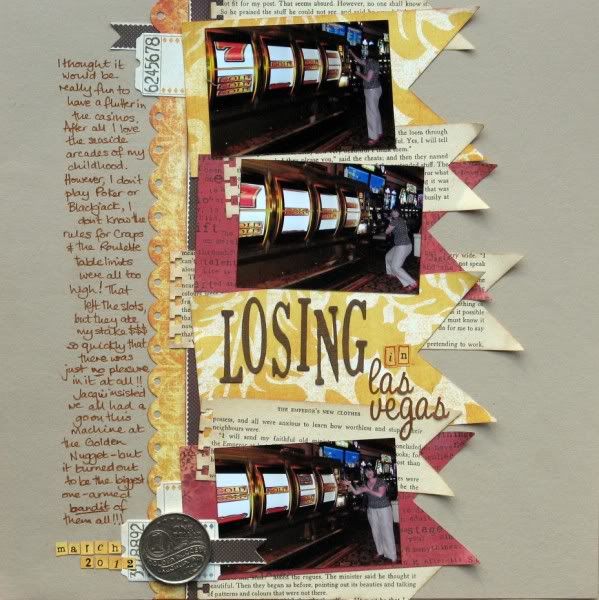
The first challenge of the month with the Counterfeit Kit Challenge Blog is to use a multi-photo sketch from Pretty Little Studio. I've used it with my April Counterfeit Kit to make a start on my photos from Las Vegas, documenting my experiences in the casinos.
The sketch called for 3 portrait photos and a journalling block on 4 pennants, but I had a series of 3 landscape pictures to scrap. They would have needed to be printed very small to fit within the width of the pennants, so I rotated the sketch through 90° to accommodate larger prints. I also switched the journalling and the title as I had a lot to say!!
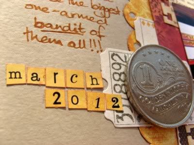
Extra pennants cut from vintage book pages, edged with an EK Success border punch, added some dimension and I topped off the page with a souvenir dollar token donated by my slightly luckier friend Jacqui!
Hmmm - not that close to the original sketch now - which is just how I like it!!


17 comments:
Sketches are all about the starting points, and I like where you ended up with this one. Love all that layering.
I love this interpretation - you have given yourself plenty of room for the story and you have some great banner action going on there too. Perfect!
I really love what you did with this sketch! It turned out great!
The rotation worked really well for your pics Jemma...love the layered banners!
Alison xx
I have to say that your page is my fave - I adore what you did with all the banner layers and I hadn't noticed that lucky dollar before and it's perfect! Gorgeous colours and overall, a great page. now if only all mine came out this good...
You used the sketch to create your own style layout and it is amazing - all those banners are great.
Love it Jemma story line very good and the whole sketch on it side is perfect for this.
I really like how you did the overlapping pennants with various papers! Great layout.
That is a great sketch and I love what you did with it, especially those pennants! Thanks for stopping by the blog hop this weekend and becoming a follower. I am happy to return the favor!
OOOOOOOOOOOOoooooo, really like how yours has turned out
YOINK **you have been pinned in order to scraplift!** ;-)
i think it works really well like this! Lots of space for your story, and plenty of room for your photos. Love your pennants!
I love how you made the sketch work for you! All the layering you did and the little souvenir, wonderful!!
Fabulous page, I like it much better turned 90degrees, left you lots of room for journalling.
Very cool, I love the layering Jemma! This rocks! xoxo
Love the layers of banners and the journaling down the side looks amazing!! Love it :0)
You rocked this sketch!! Great LO
Great rotation and adaptation. I always figure a sketch is to start and where I end up is fine ;)
Post a Comment