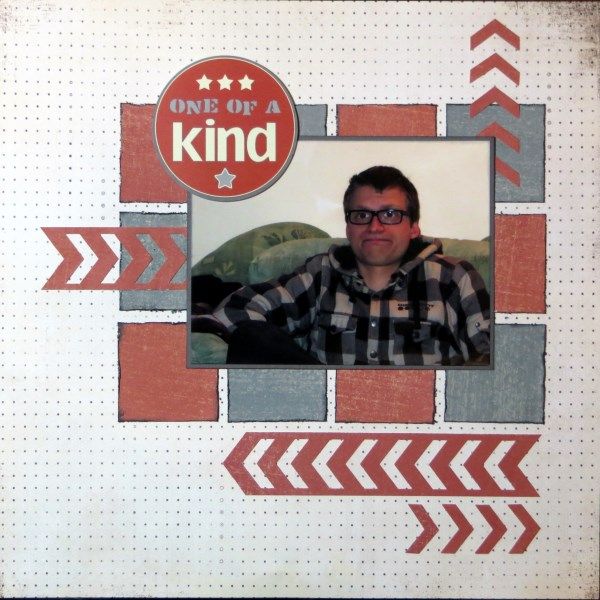
My layout was created back at the beginning of the month's crop for the CKCB's #3 Challenge: Turn Negatives Into Positives. I think that the intention was to use negative shapes from die-cuts or punches, but I've also used an attempt to sabotage a photo last Easter to make a page about No.2 Son.
He's not a great lover of my camera and often pulls strange faces ... but funnily enough, he actually used this one as his FB profile for a while! Supplies are from my January Counterfeit Kit - including that perfect sticker - he certainly is one of a kind!

16 comments:
Fantastic layout and love that you used both the positive and the negative depending on which way you look at it :)
LOL! My #2 son makes funny faces when I try to photograph him as well. I've got some beauties of silly expression photos, (insert sarcastic smile). Not always great for a memory keeping mom.
Love your placement of items and use of negative space.
And, for all your son's attempts to sabotage that photo,...it is kinda cute!! :)
Fabulous layout - I love the bold colours too!
Nice job, it would take me forever to line up the little arrows. Great color scheme too.
I agree with Susanne - lining up those arrows would have taken me hours and even then they would have been skew! yours look perfect. Great manly layout for this fun photo.
Good job of letting the photo shine.
Wonderful layout, the photo is quite amusing!
The grid design is wonderful and I agree with everyone else about the arrows - you have a lot of patience!
Great photo of him Gemma and your chevrons look really cool.
Great photo of him Gemma and your chevrons look really cool.
Love the colours and your use of chevrons
Great match of colours and patterns. I find myself wanting to respect my children's lack of desire to be photographed but also feeling a pang or two of frustration!
Love the face! Great use of negatives
x
Still loving that chevron punch I see!
I like the idea of using a die cut or design in more than one way. Great page!
Hi!
Still catching up on my blog reading.
Glad to see you are still here and productive. I love the color scheme in this layout.
Rinda
Post a Comment