Welcome to February's edition of the Members' Blog Hop from the Counterfeit Kit Challenge Blog; our guest designer Doris started us off and now you have me! I've been a bad blogger again, so today, you'll get not one but TWO layouts made with my February Counterfeit Kit!
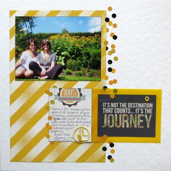
The first was done for Challenge #1 this month - use something sheer or transparent on the page.
I'd included some brightly coloured vellum and used it to mat one of the journal cards from my kit which formed the title to a page from last summer's road trip with fellow Master Forger Lesley:
A "random" sprinkling of sequins from the kit added some texture above and below the vellum.
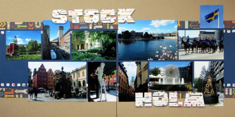
In fact Lesley "features" on my second offering for the hop because I borrowed her Sizzlit Notecard alphabet dies to make the title feature on this double layout from my Scandinavian album:
I often do a double page in holiday albums to include lots of photos of architecture or views from the cities and attractions that we visit, giving a feel for the place rather than telling a story.
It was a little tricky with this month's kit as many of the papers were from a 6x6 pad, but careful use of strips behind the photos gives you the impression that I used larger pieces!
Next stop on the Members' Hop is the lovely Tina and you can find the full list of participants Counterfeit Kit Challenge Blog today.


16 comments:
Fab layouts and love your meet up with Lesley photo!
two for one! I really should have done more but I did manage to get two more layouts posted to the Flickr gallery rather than my blog :-)
I really love that first layout with the vellum (pretty colour) and all those pretty sequins - as you can imagine, that really caught my eye!
And your spreads are always a treat with all the detailed photos you like to include! great layouts and clever use of those 6x6 papers - I'd never have noticed :-)
Great layouts, love the first one in particular.
Gorgeous layouts. Loving the sequins and paper clip on the first layout x
Enjoyed coming to your page in the hop! The picture on the first layout is adorable. Nice for you to have a good scrappy friend to make memories. Your use of sequins has me particularly inspired. They are the perfect touch to this page. I, also, like the use of the eyelet and matching paperclip.
The second page is a fabulous DPS! Clever work with the 6x6's. But, I especially love the font,...reminds me to use my old, large Sizzix font, Shadowbox that I kept. What a wonderful place for you to visit!
Love your layouts, and I especially love how you included so many photos on the second layout, but still got in that pop of pizazz!
Love the colours on the first one with all those gorgeous sequins whilst the second is a fab way of getting all those photos in :)
Wow both layouts are so cool :) Fabulous job with the sequins too
Love your sprinkling of sequins as a border...think I'm going to lift that one. Sweet that your layout is also about a fellow master forger.
Both very clever layouts. I love the sequins on the first layout plus the eyelet.Memorable photo too.
Your second layout is wonderful because you've cleverly done a double. Great photos.
I had to pin that first one because I have that same background cardstock and had no idea how to use it - and the idea on the sequins, which also stymie me, made it doubly inspiring. And you are clever, because on the second one I assumed you had used large sheets of paper. Fab scrapping, Jemma.
Nice strategy with the 6x6" papers!
Clever use of 6x6 papers, and I love the double page spread format for trip photos.
Love your use of colour in the first page.
Nice layouts! Of course I like the yellow on that first one & the sequins. And such a nice two-page spread to represent the vacation!
Super photos Jemma and love your double spreads
Post a Comment