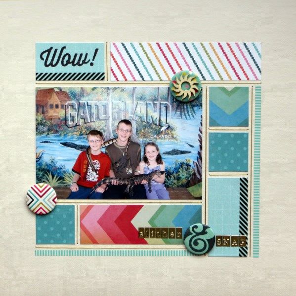
Welcome to the start of the May Counterfeit Kit Challenge Blog Members' Hop. I picked Challenge #3: Escher Effects for my hop page this month - i.e. to use tessellation in my layout design with a photo from Gatorland back in 2004:
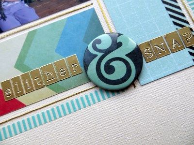
This was quick to do and brilliant for using up the scraps from my May Counterfeit Kit ... as well as creating more scraps if I'm honest! I hadn't used any of the gold thread I'd included in my kit, so I decided to add a dash of inspiration from both UKScrappers (this week's challenge) and Whimsical Musings (WM#208 to incorporate string art) and added gold threads between my patchwork pieces.
Next
on the hop is a regular contributor in our Counterfeit family - Tina. The full hop list is published on the CKCB today.


14 comments:
Lovely grid design, Jemma!
Gorgeous layout and I love that touch of gold letters.
Beautiful layout! Love the layout design and the touches of gold!
Love this--the grid design and mix of patterned papers are wonderful!
Ooo i love a grid... Might be lifting this :) jx
Oh I love this Jemma :) Love that grid style and the way you used the gold thread as a border element to that was a cool creative idea :) Will have to give that a go on a layout :) I agree I maybe lifting this one :)
Love this one Jemma! Great combination of color and pattern and the gold stitching just tops it off perfectly!
Fabulous layout..so clean and crisp. Thanks for your nice comments on my post too
the bloke effect looks fab Jemma x
Love the title. And don't they look young!
Love the use of that gold thread! Xx
ha ha! The use of gold thread to work with the WM prompt is perfect and so very neat! I think that's the reason my grids never look as good as yours - the neatness! I'm just not tidy and careful enough :-) This is a fabulous layout and I love the use of the scraps - looks so good.
It's such a great design and I love the thought that any one of those squares could hole extra journalling too, should you feel the need. And how clever..the design echoes the breaks in gator scales (is scales the right word?)
What a great idea to add the stitching - it's a wonderful graphic addition to your page.
Post a Comment