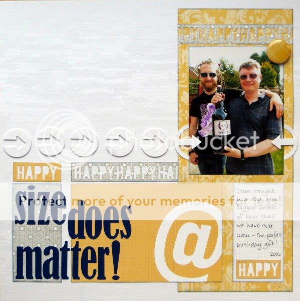
Challenge 2 at the Counterfeit Kit Challenge Blog this month introduced me to an intriguing way to think about the colours on your page: the "gallon-quart-pint" strategy. So I took a gallon of white, a quart of yellow and a couple of half-pints of grey and navy from my October Counterfeit Kit to make a page about Hubby's recent birthday bottle of beer:
I made the page last month at a Scrappy Retreat where one of the challenges was to use just 5 items of stash apart from the photo(s) ... so that's 1 sheet of cardstock, 2 sheets of patterned paper (the grey and the grid are the reverse of the yellow papers), 1 navy alphabet and 1 yellow flair button! There was a fair bit of behind the scenes paper and card gutting involved :-)
And FYI that bottle contains 3 litres i.e. over 3 (US) quarts of beer!
P.S. Who knew US quarts were smaller from UK ones? Not me!!


4 comments:
The background makes the white arrows pop off the page.Love the giant @ as well.
Love that color combination - so sharp! And that is one BIG beer!
Between the colors and the cut-outs, you completely rocked this layout.
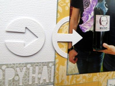
I love these type of challenges and the paper stealing is right up my street too! I love those arrows from the cardstock (I never use textured cardstock any more but this is just gorgeous) I really really like this layout and the bottle of beer is the star of the show!
Post a Comment