Well the final outcome of the UKScrapper's Scrap Factor Competition will soon be known as the final voting finishes tomorrow at 8pm BST. The two remaining contestants - Nic & Katherine - have submitted three final pages for UKS members to choose between here - so there are another six gorgeous, inspirational layouts to enjoy - plus a challenge over on UKS to scraplift one of them! Now that ties in beautifully with Challenge #3 over at the Counterfeit Kit Challenge Blog - to browse an inspirational gallery and create a page using our July kits - details of mine are here.
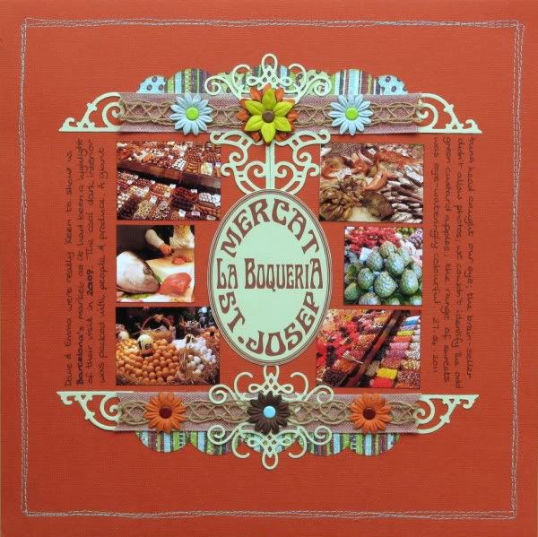
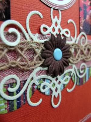
Nic's final 3 pages, all about the social side of scrapbooking (I'll update this with a link to her blog if she posts her page there after the competition closes). I loved how it included lots of journalling and photos in an interesting page design. I've used photos from Barcelona's indoor market which we visited in April on our Silver Wedding celebratory holiday! The title frame was made in MS Word using two separate Word Arts in Legrand font and an ellipse shape for the frame. The fancy borders are cut with Sizzlits Architectural Accents #3 & #4 and their Decorative Accents die.


11 comments:
Jemma, this is eye-catchingly delicious. I think it's my favourite LO of yours, ever!
Lovely layout - esp the scroll work borders and the jute (?) ribbon layers!
Gorgeous!! I love how it's perfectly symmetrical! The detail is beautiful!
Great LO Jemma...I still think the large green things are alcachofas
Alison xx
Wonderful layout! Great design with room for lots of pics. I will be keeping this for my stand out file!
Stunning layout - one of your best x
There's so much lovely detail in that LO.
Thanks for becoming my 100th follower! I've been thinking in the back of mind that if I got there I might just have to do a gave away! I guess it's time to stop thinking and go do it! :D
I love your lift of Nic's LO - photos are just right for this type of multi-photo LO :)
I just love everything about this LO, such a striking, eye-catching design and that string is LUSH!! x
great layout- I love the colours you've used and all the swirly elements - ties in with your title block so well. Great design for multi-photos - always on the lookout for that!
Post a Comment