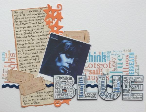
Week 3: "This week your layout shall be lyrical. Take inspiration from a favourite song and scrap away with the lyrics, title, or wherever your creativity takes you!"
At that time my favourite on-line tool was Tagxedo and I used it twice to create the background and titling for a BOM page celebrating the first album cassettes I owned - given to me by one of my (step-)brothers. Still love the music now too.
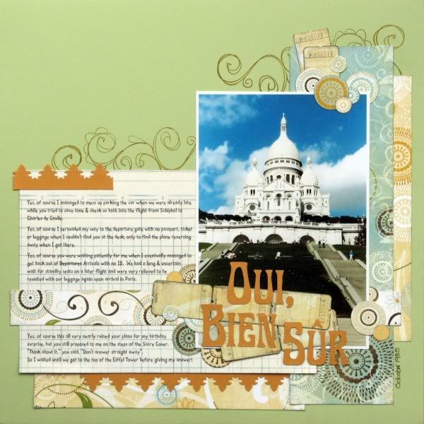
Week 5: "Create a layout with just ONE photograph. How will you give that image the special treatment?"
Having recently found our wedding album and several envelopes of photographs languishing in our attic I have a gold-mine of old, old photos ready for scanning and scrapping. I'd used one wedding photo for the auditions and thought I'd do a page about the adventures that lead to our engagement on the steps of the Sacre Couer in Paris. The whole sorry tale was part of a Sunday Storytelling here.
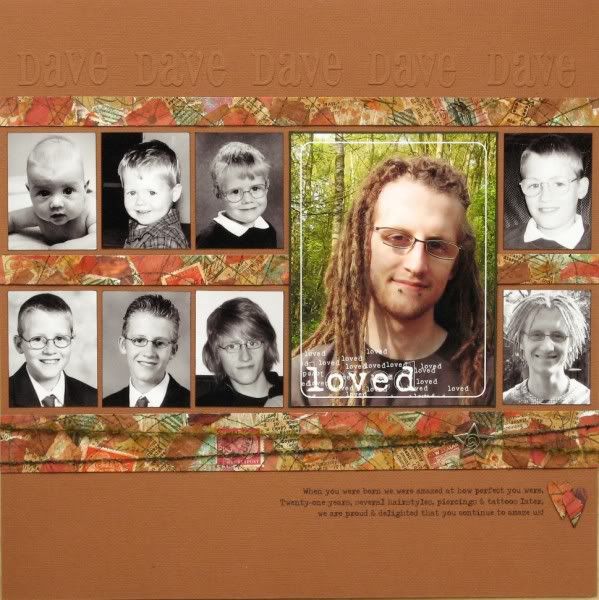
Week 6: "This week choose any theme and style you like, but you must include multiple photos! We challenge you to find unique ways to showcase additional pictures."
I decided to use a collage method taught to me by Tracie to make the paper for a page showing how No.1 Son has
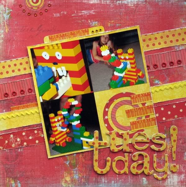
Week 8: "This week your layout should be inspired by film or television. How you interpret that is up to you: in visual design, quotation, a literal theme or something else entirely!"
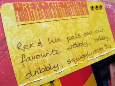
An opportunity to scrap some photos from 2006 when my three were still building things with Duplo despite having boxes and boxes of Lego available: Child No.3 had built a roller-coaster from the first episode of a crazy Aardman claymation series called Rex The Runt - the title is one of Vince's catchphrases that often gets shouted here as an argument closer! I had fun with an on-line bar-code generator for this page.
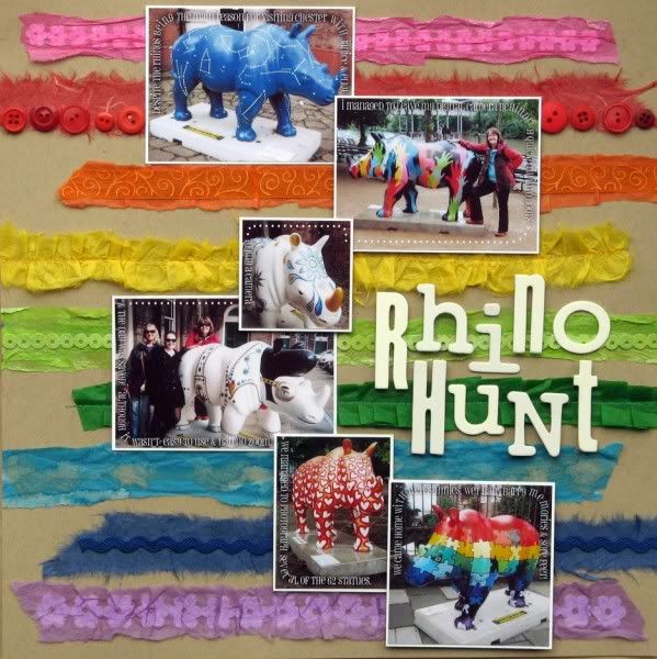
Week 10: "This week, patterned papers are OFF-LIMITS. Use plain cardstock or solid colours to create a layout that is still true to your style."
I love bright colourful pages and so a rainbow of textured tissue papers seemed like a way to meet the challenge of having no patterns. I used a different technique for each line of colour and word paths to trace my journalling about our day in Chester around the various photos.
Phew - a long post with a lot of photos - thanks for sticking with me this far :D
If you do pop over to UKS you can see the final pages of the Scrap Factor Competition from the two remaining contestants Katherine & Nic - voting is still open until Sunday if you haven't yet made a decision.


10 comments:
fun to see your five. Remember that Rhino page too - still think it is fab. Oh and the through the ages page - made me wonder how many photos I've got of my number one son... hmmm :)
That's a technique feast! The real standout feature of your lovely pages for me is the way they capture happy family memories and the pleasure you get from each others company
I love all these layouts but especially the one about your son as it really tells a story.
Lovely to see this cornucopia of colour and talent again. :)
Wonderful layouts! I really like the colorful textured tissue paper one and the one showcasing photos through the years of your son, but they are all great.
Great pages - tho the rhino one is my fave - simple but clever! I'd also love one of the rhinos in my garden - peeking out of the shrubbery maybe?
What wonderful LOs and techniques you used...love what you did with the tissue paper especially!
Alison xx
These are all great. I really love the one about your son's "evolution". It is great to see all the changes together on one page like that.
TFS
Ang
You have been busy, Jemma! I like them all but specially the page of your son. What a handsome guy, and a lovely record of him growning up.
Wauw, wat een goede LO's!
Die van Dave vind ik uiteraard super, die eerste drie foto's!Echt de Nederlandse David...
Post a Comment