Next on the hop is a brand new member of our Counterfeiting Club, so please pop over and give a very warm welcome to Anne. The full hop list is published on the CKCB today if you get lost on your travels.
Saturday, 24 September 2016
PURRfectly Placed
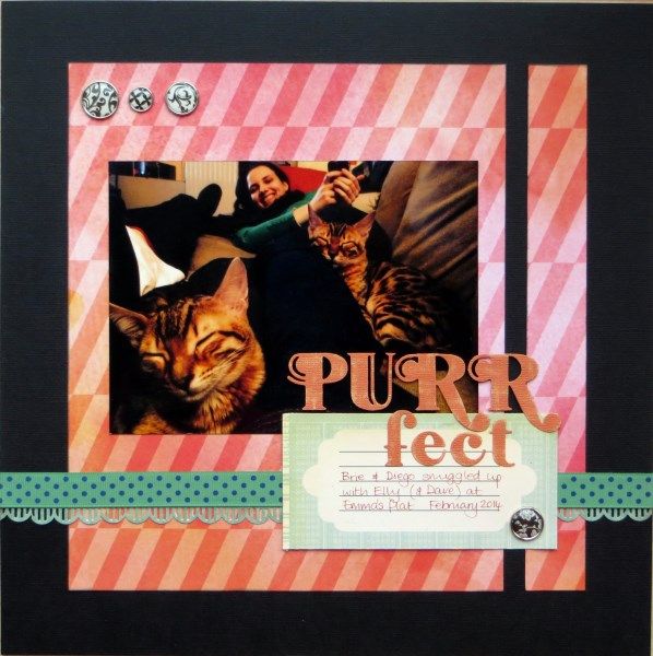
Welcome to the start of the September Counterfeit Kit Challenge Blog Members' Hop. I went rogue with the prompts this month and did my own thing with an old photo from 2014:
The photo seemed made for the colours in my my September Counterfeit Kit ... wouldn't you agree? The perspective makes those Bengal kittens look huge, but they were teeny back in 2014. Child No.3 was in kitty heaven!
Next on the hop is a brand new member of our Counterfeiting Club, so please pop over and give a very warm welcome to Anne. The full hop list is published on the CKCB today if you get lost on your travels.
Next on the hop is a brand new member of our Counterfeiting Club, so please pop over and give a very warm welcome to Anne. The full hop list is published on the CKCB today if you get lost on your travels.
Subscribe to:
Post Comments (Atom)

11 comments:
That is such a great photo. And is that PINK paper - or just a trick of the light?
Lovely layout, I like the title. And thank you for your nice welcome words.
You are right,the whole thing works beautifully.
Oh this is splendid, the black and green are perfect counterpoints to your background paper. Love that photo too!
Fun page! I like the crossed black and teal/blue polka dot strips and that cute little scallop too!
You rebel!
I'm with Julie, there's a definite pink in there. Nice clean layout and yes those colours are purr-fect!
they do seem rather large! ha ha. perspective is a great thing. I agree on the PINK!!! Funny. It's a great layout with the black elements really bringing your eye towards the super photo. love it when you go rogue - you rebel, you!
I love the way this all works together! Perfect, indeed!
It's a fun and beautiful layout! Definitely perfect! Love the color scheme of the layout too.
Cute layout!!
They do indeed look large and fierce - great action shot! Your horizontals and verticals show the photo off very nicely. Like the contrasting colour too.
Post a Comment