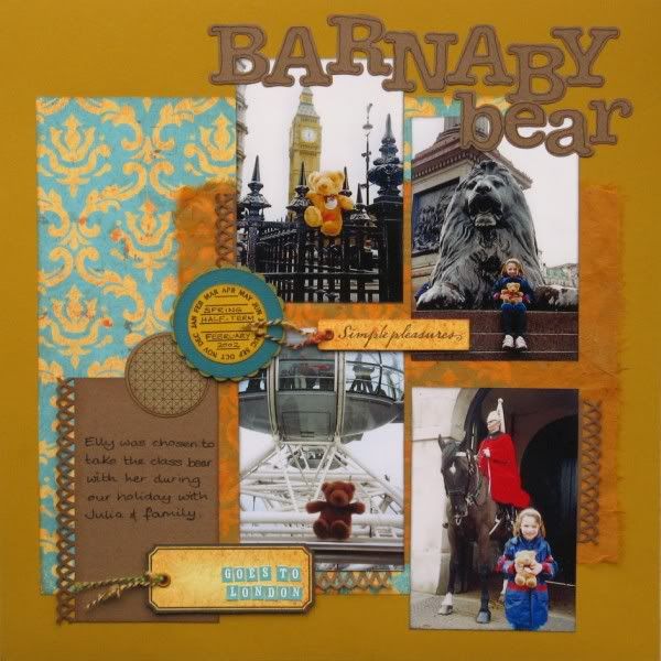
Here are the first two pages made with my Counterfeit Kit for February. It was strange not rooting through my supplies of paper, card, alphas etc to make a page and just opening my CKCB pizza box instead. Faster for scrapping though :D
I was using a sketch from the Monthly Challenge on UKS which also required the use of fibres - luckily that was exactly what was in my kit! I have used a Martha Stewart border punch and some Round-a-Bout Sizzlit dies for the border and title respectively which were not in the kit, along with eyelets, inks and a journalling pen from my own supplies.
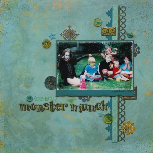
On a roll, I completed a second page yesterday - this time using my, much neglected, Poemstones from 2006!!!
Again I was taking inspiration from a challenge from UKS (with a Pagemaps sketch) and the only non-CKCB items that I used were a couple of border punches, inks, a tiny bracket stamp and threads. As all the cousins are eating donuts in the photo, I was originally going to title the page "The Munch Bunch" as suggested by a crop friend Sue, but as I wasn't comfortable with that title wiping out all the "H"s from my sticker set, I adapted it.
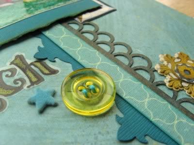
The loopy border was yellow (it's the reverse of the blue ogee paper you can see), but it was much too bright so needed dabbing with black ink to tone it down.
So there you have it - I've made a start with the kit and got over my fear of cutting into the pages and using up bits of the kit - worrying in case the page around the corner needs this piece of paper or that alpha sticker or those buttons! It won't (and even if it does, I'll find a way around it won't I?!). After all the whole point about the CKCB is make do and mend!!!


16 comments:
Outstanding layouts. Your colors are beautiful together. I love the big letters you used in your first layout and those tags are cool looking. On you second layout what are Poemstones? I have never heard of them. Great title for you photo.
These layouts are both the perfect showcase for your stunning kit colour scheme. It looks so fresh - I love it! Kits? I think we might have you converted..
I am still lovin' your color scheme here! Awesome layouts!!!
*meridy*
Stunning both of them as I have already said but I know it nice to get comments on your blog so I'll say it again, Stunning.
Gorgeous pages! Love the colour combinations of both.
Would you be able to send me your email addy so I can send you the details of the March Sarah's cards challenge? :) Thanks
Rachael
x
I love the gold and Teal together. really great.
TFS
Ang
These colors are awesome together. You did a fabulous job with everything.
dynamite great close-ups
What a great success these are! I love your colours and inking to tone down something is a neat and inspiring manoeuvre!
Loving your pages : )
Your layouts are beautifully composed! I love all of the little touches!
Bethany
I love your pages, they turned out beautifully!
Great pages...they look fantastic & I much prefer the title Monster Munch... very apt.
Sue x
Great pages and I particularly like the monster one
Great take on the frame challenge! Thanks for playing along at The Studio!
I love love love love your lo's!! They are GORGEOUS! I loveeeeeeeee the designs, and your photos! Thanks soooooooooooooo much for playing along with The Studio! :):):):):):):):):):):):):):):):):):)
Post a Comment