Do you enjoy the Sunday Stories that you read here and via
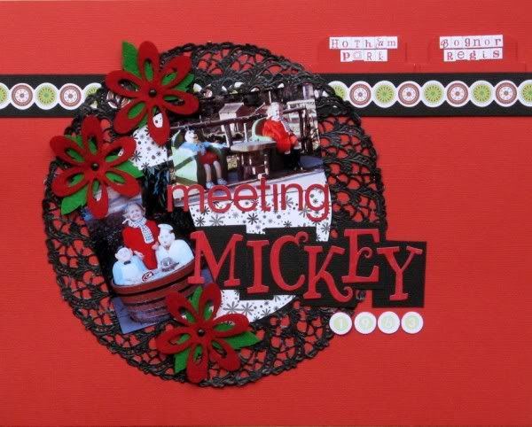
Siân's Blog? I do - but one of my 2012 goals was to get more of my stories down on paper i.e. into my scrapbooks! So here is a page from
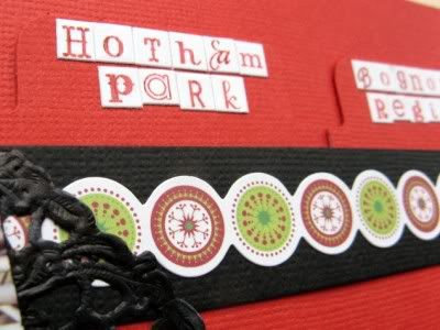
last August's Sunday Storytelling with the memories hidden away on those two pull-out tabs:
The flowers were in my Christmas embellishment swap - thanks
Susanne! - and I was inspired to try colouring a doily by
this page by Kirsty. The tiny alpha stickers are by Adornit and come in a mix of colour combinations dominated by black, red and white. Unfortunately the printing (on my sheet?) isn't quite true so some of the letters end up with a black or grey (or white) strip along one edge which is annoying once the stickers are off the sheet. I guess that's the trouble with buying my supplies on-line - I have no idea if it's a one-off or a general problem with this range!
My layout is based on my
Just One Sketch sketch - rotated as per prompt 2 of the class - yes I am
a little very behind as we just had prompt 11 yesterday! It's also not square as the page is for my BOM which is 8½"x11"
and I've changed the shape behind the photos to a circle
and there's no border! In fact, as usual, I have deviated quite a lot from the sketch - but then I always see sketches as a starting point rather than something to stick to rigidly! Do you like sketches? Are they recognisable by the time your page is done?


15 comments:
I totally agree about sketches as just being a starting point....and I love the red and black colour combo here.
Psst - just say it's for the 'change lines to circles' prompt and you're not behind at all!
I definitely look at sketches as a starting point. Fun colour combo - so very Mickey.
Oh, and yeah - a sting sounds like how I'm feeling about and missing my brother right now.
As I have already said I love that mixed fonts on the tags and the underlining just adds to the effect.
I usually start with the sketch then deviate sometimes it is still recognisable but at others not at all.
Oh, yes! I remember that one and now it looks as good as it reads :)
I'm pretty hopeless with sketches I have to admit. Moving stuff about on a page seems to suit me better most of the time. Though I did sign up for class and have been inspired by what I have been seeing. She's clever, that Miss Smith!
yay you for getting the story into the scrapbook! Definitely agree sketches are a starting point :)
Thanks for the acknowledgemernt - flattering to be able to inspire anyone else. Love the colours on your page
Love the bold colours and the tone on tone tags. I've had a couple of different mini alphas from Adornit and mine have been okay - maybe it's that batch?
Love the colours...especially how you coloured the doily!
Alison xx
I love the you've used your sketch as an inspiration. I totally agree that it's a starting point, not a restriction.
Coloured doily = awesome!
That coloured doily is just fab. Another great layout...love the jumbled fonts on the little letters!
I'm playing catch up on blogs at the moment. This is a lovely idea to actually get the stories down on paper and a lovely layout.
I'm even further behind - I haven't done a single LO yet!!
Nice bright page - it has a Christmassy vibe.
Those flowers & the colored doily are perfect on this layout.
I usually follow a sketch pretty closely; I think it's just my organized brain likes it all to match up or something! LOL Although I do deviate occassionally.
Very striking, the red and black ... I like the detail of the little circles along the top too. In fact, this page could do double duty for 'rotate' and the later 'circle/rounded' theme if you feel behind. :)
Hmmm, think I need some black doilies,
Post a Comment