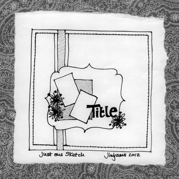
Here's my sketch for Miss Smith's Just One Sketch Class. Still way behind on the prompts thanks to the feed issues, but hopefully I can catch up a little this weekend. I started fiddling about in Photoshop Elements before deciding that there was nothing wrong with good old pencil & paper (& marker pen & scanner LOL).
Thanks to some welcome extra feed-back about my "style" as seen on my example pages I've added a couple of extra points (thanks guys):

7 comments:
Like that sketch going to use it sometime really soon
You drew that? It looks so good! Believe me, my sketches look nothing like that lol
Am very impressed by your sketch...looking forward to seeing the LOs
Alison xx
Great sketch - can't wait to see some layouts with it.
It's a great sketch
Love the sketch!
I'm working on putting together a little book with the faces that we colored as part of Mel's project, and I just wanted to tell you how happy I am to have a little piece of your artwork to include in my book! :o)
Don't worry I'm behind too and haven't produced a LO yet. Do like the not frou-frou comment - I can relate to that!
Post a Comment