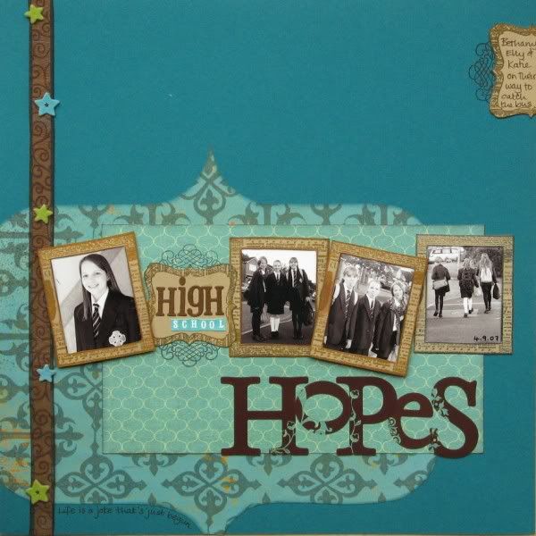
First off we had to choose some favourite pages and analyse what features they had in common (click on them for a closer view if you're a glutton for punishment LOL):
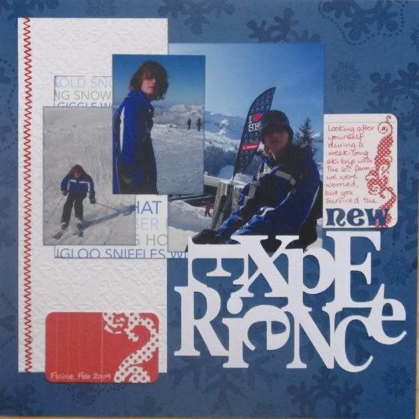
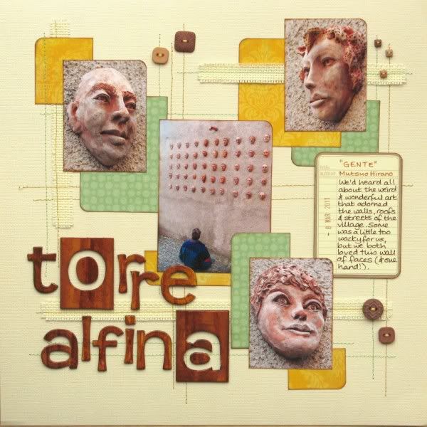
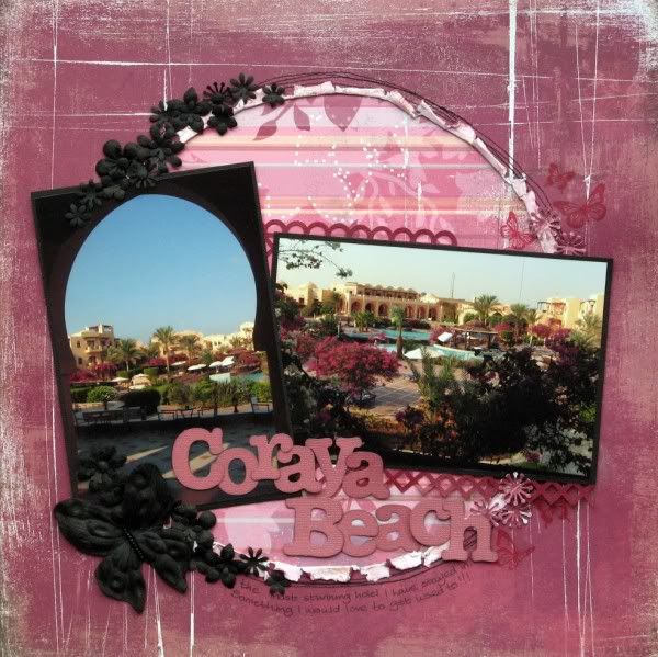
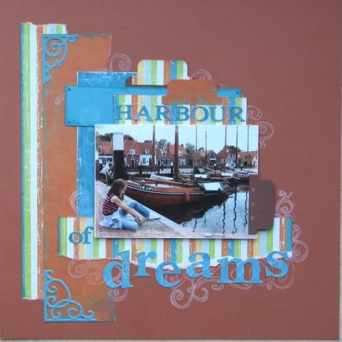
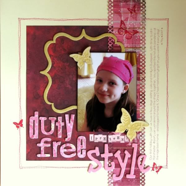
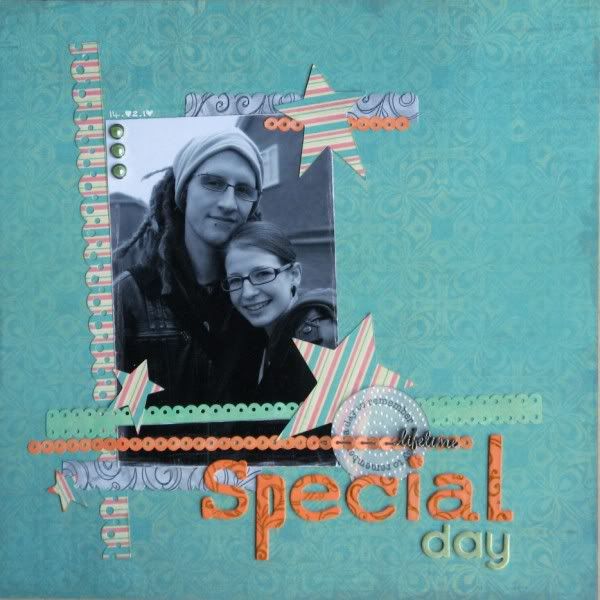
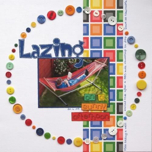
I've purposely only looked at single 12x12 pages although I do like double paged layouts and also scrap some 8½x11 pages. It was hard enough choosing just these!
Well I see:
- Layering and overlapping
- L shapes: either formed with the photos and papers or the photos themselves
- Curves: curved shapes or at the very least rounded corners
- Uneven titles to squeeze large fonts into a small space or titles split over several lines with mixed fonts
- Quite full pages
- Not a lot of visible journalling
- Maximum 2 patterned papers
5 comments:
well done on finding all those things in common, I could only find the title one.
I think it's the bold colours and the titling that stand out for me. And you seem to prefer tertiary colours (hope I have the term correct and don't end up sounding a pretentious muppet!)
You don't receive e-mail prompts - you just need to go back to the blog page every Saturday to check.
What great pages! I'd add plain (ish) backgrounds and strong colours and a strong, clear design (not wishy washy or frou frou!) If that makes sense :)
I'm only really noticing this for the first time now, but I think you use quite a lot of frames or things inside other things.
I reckon you've found all the common features Jemma...I've still to get to parts 2 and 3 of the class!
Alison xx
Post a Comment