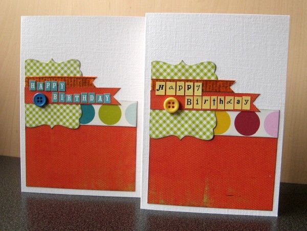
The third challenge this month at the Counterfeit Kit Challenge Blog is to make two cards with the same design: one masculine version and one feminine.
This got me thinking about what makes a card suitable for one sex or the other. Looking in the shops, the girly cards have flowers, shoes, handbags ... and the manly ones feature boats, footballs or power tools! Hmmm, not every woman spends a fortune on handbags (or wants to), nor does every man like to fish!
Anyway, my cards rarely feature objects these days - they're just made with scraps from my kits, so I guess that just left me colour ... pink for a girl and blue for a boy perhaps?
I decided to start with a card sketch and see how small a difference I could get away with using scraps from my October Counterfeit Kit. The Sampler Kit Club has a great card sketch challenge this month which I stuck very closely to:
Identical in design, I just used slightly different coloured dots from the Echo Park Lazy Days paper and then picked out one of the dot colours with my kit's tiny alphas and buttons. {I'm very irritated by the Cosmo Cricket Tiny Type teal stickers ... WHY is that "A" so ridiculously small? The "R" and "T" are also shorter than the rest of the letters ... is it a coincidence that they spell "art" or do I smell a "rat"?}
While the card on the right is definitely more feminine (thanks to the pink), I can't really say that the other one is only suitable for a man. My Mum reckoned I should have included more brown ...
What do you think?

12 comments:
Well, I think they're both lovely cards - and in general I prefer cards like this that aren't overtly 'girly' or 'masculine' anyway! :)
I think it looks "manly"! I think this is a wonderful idea for a challenge and you have illustrated it perfectly - it's got m thinking too. I wonder if I have time this week to have a go at this? I'd love to try
Great design for switching out little details - nicely done!
I think this was a great challenge - all the DT results were fascinating. I love what you did with this, and I feel your pain about letter stickers that aren't all the same size - drives me nuts!
Rinda
Very nicely done Jemma!
Alison xx
These are so well done - I like them both & don't think they need anything extra. The one on the left could definitely be used for a male or female birthday.
Handy to have cards that are suitable for either! Laughed at your clever sentence in italics :). They are both lovely - I think the choice of lettering on the right also gives it a more traditionally feminine feel.
I have lots of those teeny letters too and they annoy me because of the variation in size too! I think they both work really well.
great card. love the two different takes. thanks for playing with us at the sampler.
I'm often uncertain about masculine cards - I hold them up to Wookie to say 'would your brother mind this?' :lol:
The different letter sticker sizes bugs me too - nice to know I'm not the only one. I like both and yep I do cards out of scraps a lot so they tend to be fairly generic.
The one on the left has the colours I use the most for my son´s pages. :D Nice design.
Thank you so much for playing along at The Sampler Kit Club blog. Your cards are really cute! I say the one on the left is masculine enough for a boy. Great job!
Post a Comment