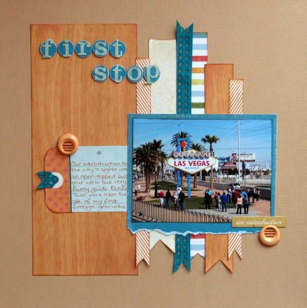
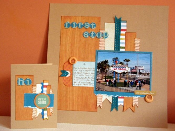
Back in March I was lucky enough to visit Las Vegas with some scrapping friends. I'm making slow but steady progress with the layouts about the trip and I've just used one of the first photos in a page prompted by the second challenge this month at the Counterfeit Kit Challenge Blog: to scrap a layout and then use the same design to make a card from the scraps.
I often start with sketches and I thought that if a card was on the menu perhaps I'd start with a layout from a card sketch! I grabbed one from Sketch Support (#18) and cut strips from the papers from my August counterfeit kit.
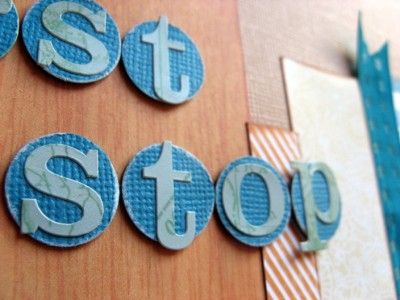
To echo the "Welcome" from the sign I backed the title letters with punched circles and mounted them on foam pads.
Our first excursion in Las Vegas was a hop-on-hop-off tour in an open-topped bus - always a great way to get a feel for a new destination. The first stop after joining the circular tour was, appropriately, the Welcome sign and it was possible to get out to take photos and join the next tour bus afterwards. However, we chose to stay put as our tour guide Renée was so funny {she thought we were funny (peculiar) as we were in Vegas for stash shopping in Michaels!}. I was also scouting for geocaches in Vegas and luckily the virtual cache here just required a photo with GPS receiver in the frame - so that was my first foreign geocache sorted too!
Having cut up strips for my page it was a piece of cake to cut some of them smaller to make a card - substituting a sticker for the photo and some ric-rac instead of ribbon. No dimensional buttons though as the UK post system charges extra if your mail is too thick! Do you make cards from scraps? It's a great way to use them up!


20 comments:
That is a cool LO and a perfect card for a man may have to copy that one.
I love the way you've used the same design for the two of them. They are both great with wonderful colours. I love using scraps to make my cards.
Love the striped effect....and the blue really pops.
I use scraps for cards a lot...even tiny pieces are great for cards.
Those colours and the design is great for your photo - and I like the buttons (?) on the layout. Are they wooden?
I'm really intrigued by the way the design works for both. Love that! I had been thinking about making some cards this afternoon. You have got me thinking..
Sounds like such a fun trip! I love your card and LO, the colors are beautiful and I love the paper ribbons!
Wow! I really love this design and the colors you chose, works beautifully for both!
Lovely colours & layout **clicks "pin it"**
Love the woodtone against the blue and those long strips are great.
love the colours and sketch works great for card and lo. and yes you are very funny (perculiar) i love that too x
Love the colors and the way you used the sketch! I also like to whip up a quick card from scraps and copy my layout design. Your card is wonderful!
I love the color scheme you chose!
I have planted a geocache.
Rinda
Wonderful work! I just love the colors, which give such a great show for the photo.
And it's so great that your card is with the same sketch and papers! simly great!
Love the papers you've chosen..and that card is too cute!
Alison xx
Very nice page & card!
I really like the colors in your layout!
love that bright blue/teal color - perfect with the sign :~)
Just bought new napkins that co-ordinate with your colour scheme :lol:
Yep, make cards from scraps and have been known to alter page designs to ensure I have the right pieces left for the cards too. Yeah for geo-caching and Micheals shopping.
Love your layout, with the hanging banner strips - and your card adaptation is right on the money (that's something they'd say in Vegas right?).
This is a great way to use scraps. The card and layout are both fantastic.
Post a Comment