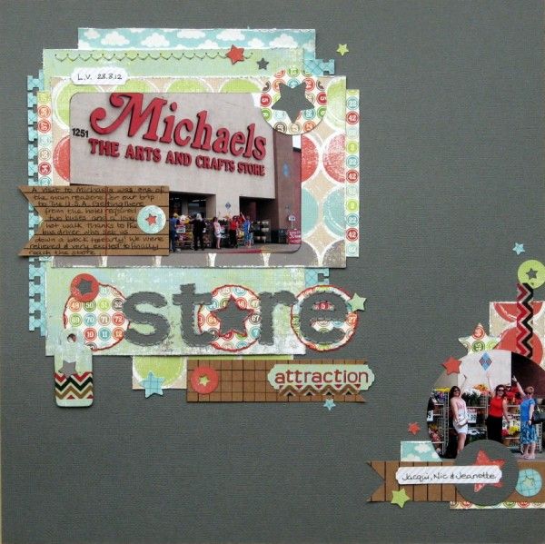
OK, I don't have a fancy machine but I do have plenty of punches so I got busy with some stars and circles to go with a photo of a Michaels store in Las Vegas that was the highlight of our stash shopping {and the starting reason for organising a trip to the U.S.A.}
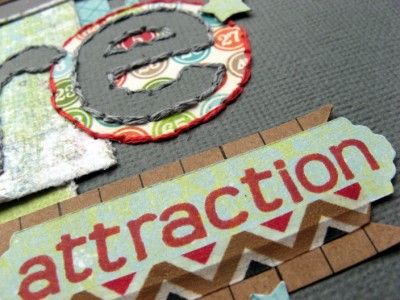
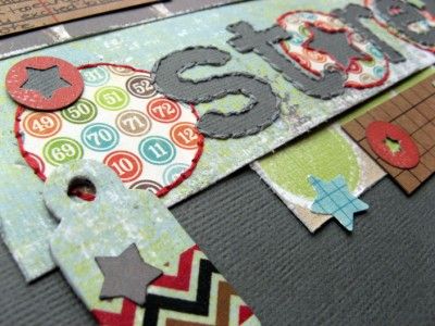
Thanks to Clair's recent Stitching On Paper class I'm still exploring hand-stitching and had fun with a great technique I learned from Kinsey Wilson's blog which I used to make faux negative space letters for my title. I've used one of my favourite free fonts, Teen, which matches my teeny tiny Banana Frog stamps and my diminishing supply of Scenic Route chipboard alphas .
Challenge combining as ever, I've used the August sketch from Scrapfriends as part of a September Weekly Challenge on UKS.


21 comments:
What a great layout...I like your negative space.
Perfect for this layout.
Love all those patterns. So what did you buy?
lol I love your faux negative space and it looks more negative than a lot of real ones do on the computer as my eyes play silly bees and reverse the shadow lol
Love it! Especially the cluster on the RHS and the way you've used a photo there!
What a great page....love all the combinations of patterned paper and how you've stitched 'store' on.
Oh hunny, I LOVE the stitching!!!
Must have taken you a while but so worth it.
Wow, there are so many details to enjoy on this page! You have turned the challenge round and used it absolutley to your advantage
Awesome layering, and I love the stitching!
Lots of lovely detail here - and I especially like that star used for the O. Very clever!
This is such a great use of negative space!
Oh Jemma! This is awesome! I love the faux negative space :)
Love the colors.
Rinda
very nice looking layout!
I've been looking enviously at all those machines too! Love the stitching and layers.
Oh and trips to craft stores are always on the itinerary when ever I go to the US.
love it love it love it
and love the fact we will be together again in March!!!
hummm liking the faux negative space, however I do have a fancy machine so I really should get on and use some vrai negative space soon. Thanks for the inspiration as always.
Details, details, details - fabulous creation!!
This looks GREAT! Love your title treatment and the amazing stitching details!
Wait....your letters aren't really negative space? I love it! The stitching is great, too.....really great title and page! (and now I want to go shopping!) haha
Lots to look at here. This page is just as much fun as a trip to Michael's
I'm jealous of a trip to Michaels! Another fab layout and I think I recognise some MME Boy papers there?
Post a Comment