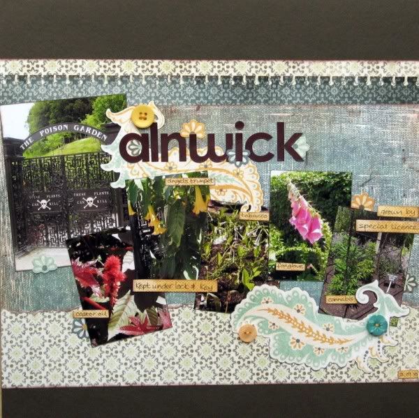
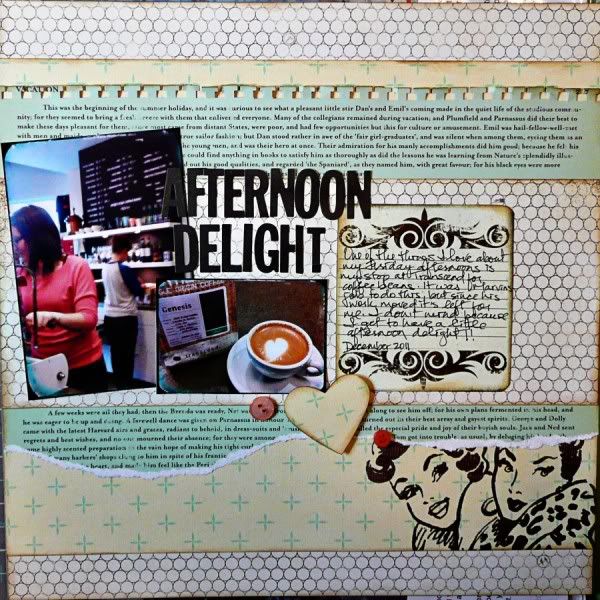
A month or three ago I was invited to take part in a Pass the Page venture by my friend Julie (aka JSquared). She collected a group of 14 of us together and sent a page off into the ether to be scraplifted by each of us in turn. The person before me in the chain was Ginger (if she sent you here then you're on track, if not, you might like to start at the beginning with Julie here). I scraplifted Ginger's lovely page to produce one for our Northumbrian holiday album:
We visited Alnwick Gardens where we enjoyed an interesting and informative guided tour of their unique Poison Garden (as well as exploring the beautiful water features). It's under lock and key as there are some seriously dangerous plants in there along with others like tobacco that generally kill in more indirect ways. They even have a special licence from the Home Office to grow cannabis - well out of reach of visitors - with a sign exhorting us to "Keep Off The Grass"!!
Can you see the resemblance to Ginger's page? I kept the punched border and layered horizontal strips of papers, but needed more photos and less journalling. The papers are from my home-made November Counterfeit Kits.
I wonder what elements were kept or discarded when Lisa-Jane scraplifted my page? Before you pop over to see, you should know that there is a prize available on this Pass the Page hop, kindly supplied by Deb Clark, all you have to do is comment (here, there and everywhere)!


29 comments:
I enjoying looking at how you have all been inspired - what a great idea.
Great page - love how you get a lot of photos on a page without it looking cluttered. Sounds like a really interesting place to visit.
Aaaannnd, we're getting back to the multi-photo idea again, just like Julie did!
How interesting this is and what fun!
I so like your photos and the way you have set them out. The embellishments are lovely too and I see you've used the same "notebook" punch at the top of your page, as Ginger! The greys and blues in your papers give this page a very calm feel. I like it!
Liking what you've done Jemma...wouldn't it be funny if the LO has come full circle..I can't wait to find out, but am being good and going in order!
Alison xx
Yes, I'm getting madly excited to see if your twist has changed it back round to something closer to the original..
The multiphoto layout is your speciality, no doubt about it! I love the sequence of pictures you have here and the way you have made it your own.
Beautiful page! I love the layout!!
Grteat take on the insdpiration LO. Well done. i've ben to Alnwick castle, but missed the poisons garden - sounds fasinating
Lovely colour scheme. I really like the photos used too x
Love how many photos you got on the page and the lovely use of colour.
I love it!
Brilliant! How fascinating that you've used more than one photo, like the original - love the way you've kept the same edges to the paper and your lovely embellie echoes the shape of Ginger's torn edge on her LO. So intriguing!
admit it Jem, you went for the "pot" plants ;-)
Great layout, so similar yet so different. loving the emblellishments.
I love the mood and the colors of your page. As I hop along it is funny to see that the scattered multi photos from the very first page have gone and come back :)
Yes I can see the resemblance to Ginger's page... like how your have used the punched strip and the extra photos. Interesting story about the plants too.
This has been quite a journey but its been great to see how it has morphed. Thank you for your inspiration - I almost ended up using the same papers because I love them so much but I stopped myself - part of the fun is in the development right? Sorry my photo of yours is so small, I didn't want to ruin the look as it was so blurred, no idea why but I'm still learning. Great to "see" you again xx
I love the way you've interpreted this - the papers are beautiful and go so well together. The poison garden sounds intriguing too :)
Love this page....I'm a great fan of a series of photos across the layout....and these work beautifully.
I love this page Jemma
Isn't it amazing the difference between the first and last. I love the fact that you have added many photo the same as the first but most of the middle ones only had one.
Yes, it is really interesting to see how the original has changed and is started to reappear! Great layout Jemma!
Oh my! This is great!! I love that you added more photos! Love your layout Jemma :)
I love your great page Jemma, & what an interesting garden...an Agatha Cristie style poison garden at that! I can also see the resemblance to Gingers' page, & what great papers you have used too.
We are heading back to a number of photos again, but then I change all that! Hehehe
Thanks for hopping along todgether. xx
oh yes! another gorgeous page and one that also speaks my style! love it. The MME papers and swirly elements are so pretty and the two buttons are perfect. I love your quirky arrangement of photos. I've never done this type of challenge but it looks a whole lot of fun - can't believe the change this had undergone since the original layout ;-)
I've missed all the fun lately and have really enjoyed sseeing a few of these. I love what you have come up with- great layout x
Very well done! I'm enjoying watching this move from person to person :)
Beautiful pictures and I love the flourishes! How cool that we're back to a multi photo layout.
Love your colour scheme and selection of photos Jemma. So interesting to see how it changes all around the hop!
Fiona xx
Loving your interpretation of the page (and increase in number of photos). Thanks for taking part and hope to see you again at another crafty weekend.
Ooh I really like the sound of the poison garden... is that wrong?? ANother great page in this fabby blog hop, the buttons really help to pick out the colours and make it pop more xxx
Hello! Hello! I'm sorry I've been MIA for so long. I have so missed reading your blog and catching up, but it seems we both had a mis-spent Christmas!
Your take on the layout is just lovely - and the multiple photographs are back. Exciting...
Your scraplift is, to my mind, pretty close to the LO you received, b ut so completely different (if that's not a contradiction). I love the result.
Post a Comment